Why localisation matters more than ever in digital learning

Digital learning has opened doors across the world. Today, organisations can reach learners in every region, time zone, and language – all with the same course.

But here’s the catch. If that course only speaks one language, or doesn’t reflect the learner’s culture, the experience can quickly lose impact.

Learning hits harder in your own language

True learning happens when the content feels like it was made for you – in your language, using examples you understand, and visuals that feel familiar.

Research shows people learn better in their native language. When learners can read, listen, and interact in words that feel natural, they stay engaged longer and remember more.

And it’s not just about understanding the content. When training feels local but still clearly reflects the organisation’s brand, it also sends a powerful message: you belong here. It builds trust and a sense of inclusion.

More than words – it’s about culture

Mighty gives Rise a creative boost – more flexibility, more polish, same simplicity. Localisation isn’t just translation. It’s about making learning fit the learner’s world.

That means thinking about things like:

  • Local sayings, examples, and references
  • Colours, imagery, and people that feel familiar
  • Regional rules or compliance differences
  • Accessibility and reading direction (like right-to-left languages)

When learning looks, sounds, and feels local, it’s far more likely to land with impact.

Why localisation is now essential

In some industries, delivering training in a local language isn’t just nice to have – it’s a legal requirement. But even beyond compliance, localisation shows care. It’s about inclusion and accessibility – making sure every learner, everywhere, gets the same quality of experience.

An English-only course might once have been acceptable, but in a global workforce, it now feels outdated. Localisation tells people: we see you, and this is for you.

The technology has finally caught up

For years, translating e-learning was slow and complicated. You had to rebuild or manually edit each version. A nightmare for global teams!

Now, AI-powered tools are changing that. Our current favourite on the market is Articulate Localization (part of the Articulate 360 suite) and modern workflows like XLIFF export/import, you can:

  • Translate courses instantly into 80+ languages
  • Keep a glossary so brand terms stay consistent
  • Let reviewers check and approve translations right in the platform
  • Manage all language versions as one single project
  • Publish all languages together in a single package

It’s faster, smarter, and crucially affordable. If you already use Articulate 360, you can even update your translated courses at no extra cost within the same subscription.

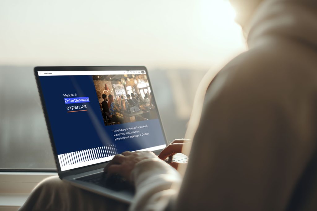
Costain Articulate Rise Elearning

Built for modern learning teams

Articulate Rise 360 has always been known for its simplicity and speed. Now, with built-in localisation, it’s even better suited to global learning projects.

Courses automatically adjust layouts for different text lengths and support right-to-left languages like Arabic and Hebrew. That means less time fixing formatting and more time focusing on great learning design.

Sure, AI translation isn’t perfect. Complex or technical topics still need that human eye – but for most learning content, it’s an excellent starting point.

How other tools compare

From our research, Gomo stands out as another strong player in this space, supporting over 160 languages. It’s great for very large-scale global rollouts.

That said, its design options are a bit more limited compared to Articulate Rise, especially now that Rise can be enhanced with custom design tools like the Maestro “Mighty” plugin, which gives teams more freedom to match their course design to their brand style.

So, if you need wide language coverage, Gomo is powerful. If you want a balance of translation efficiency and beautiful, brand-aligned design, Rise is hard to beat.

The impact of getting it right

When localisation is done well, everyone benefits:

  • Learners engage more and complete more courses
  • You save time and money by avoiding rework and support calls
  • Global teams roll out training faster and more consistently
  • Compliance standards are easier to meet
  • Your brand feels strong and connected across every region
Costain Articulate Rise Elearning

The bottom line

In today’s connected world, localisation isn’t a luxury – it’s a necessity. It transforms digital learning from a one-size-fits-all broadcast into a personal, meaningful experience.

At its heart, localisation is about people. It’s about making every learner feel seen, valued, and included, no matter where they are in the world.

When training speaks a learner’s language and reflects their culture, it shows respect and builds connection. That’s when digital learning stops being just information delivery and starts becoming real communication.

The future of learning is global, and global learning only works when it feels local.

As experts in Articulate 360 (Rise and Storyline) elearning design and development, Eggu are the perfect partner to support you in creating affordable, branded learning experiences, delivered in multiple languages.

Get in touch with Eggu about your next localised Rise project.

Using Mighty to take your Rise courses to the next level

If you’re already building your elearning in Articulate Rise 360, you probably love how quick and simple it is to use.

But maybe you’ve also wished you could do just a bit more – a little extra polish, a little more personality, a little closer to your brand. That’s exactly where Mighty comes in.

So, what is Mighty?

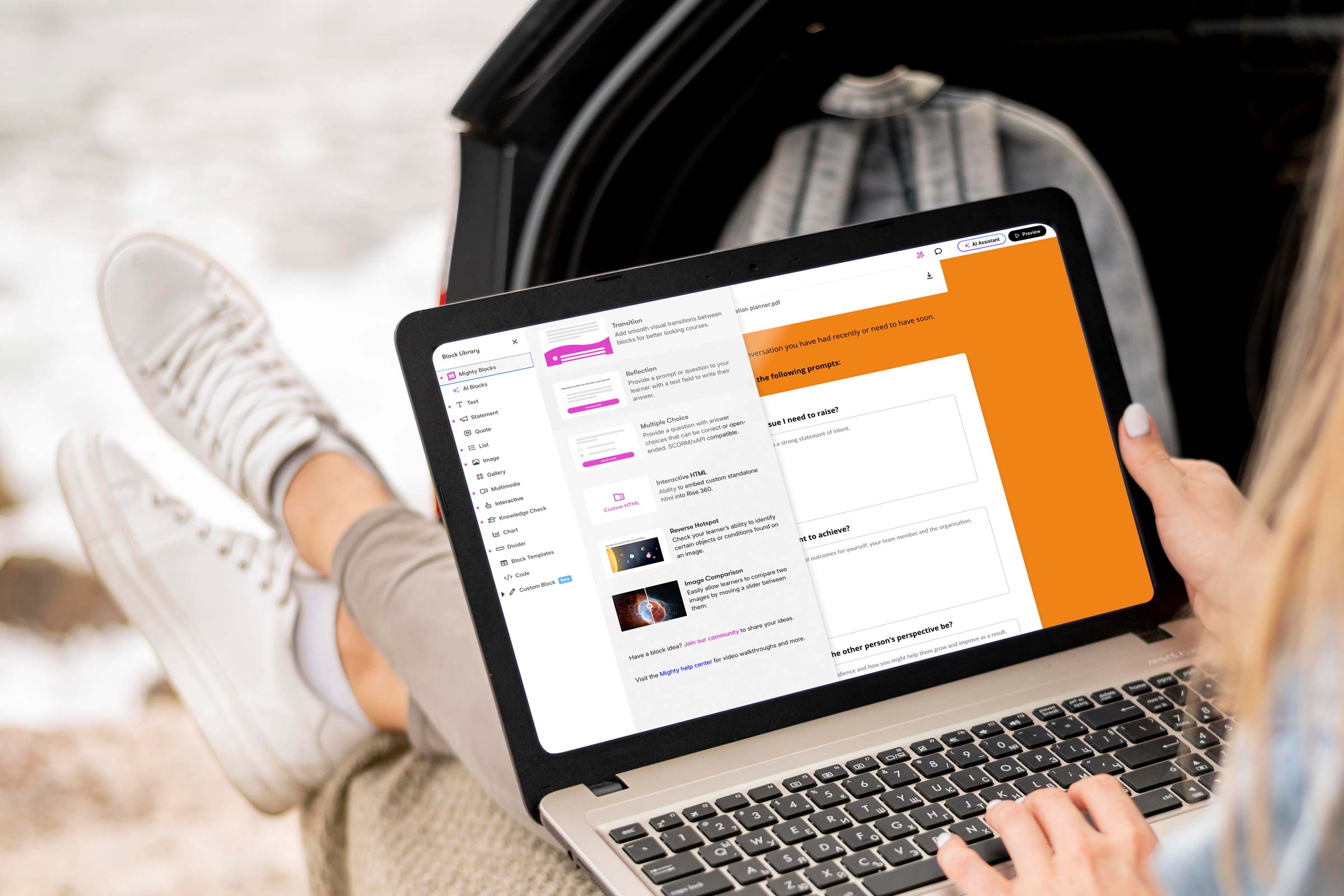
Mighty is a Chrome browser extension created by Maestro Learning that plugs straight into your normal Rise 360 workflow. It’s not made by Articulate (the company behind Rise), but it works right alongside it, adding extra design options, new content blocks, and more creative control.

Think of it as a set of design “power-ups” that unlock features Rise doesn’t include out of the box. You still build your course in Rise, but now you can adjust things like typography, colours, transitions, and layout with far more flexibility.

And the best part? You don’t (always) need to know any code.

What does Mighty add?

Mighty gives Rise a creative boost – more flexibility, more polish, same simplicity.

Here’s what it brings to the table:

  • Extended typography controls: Fine-tune font size, spacing, and line height so your text looks perfectly balanced.
  • Custom colour palettes: Save and reuse your brand colours across every element of your course.
  • New visual and interactive blocks: Add reflection prompts, custom buttons, multiple choice variations, transitions, and other engaging layouts.
  • Enhanced transitions and animations: Create smoother, more dynamic movement between sections.
  • Quick styling tools: Adjust spacing, alignment, and backgrounds directly in Rise.
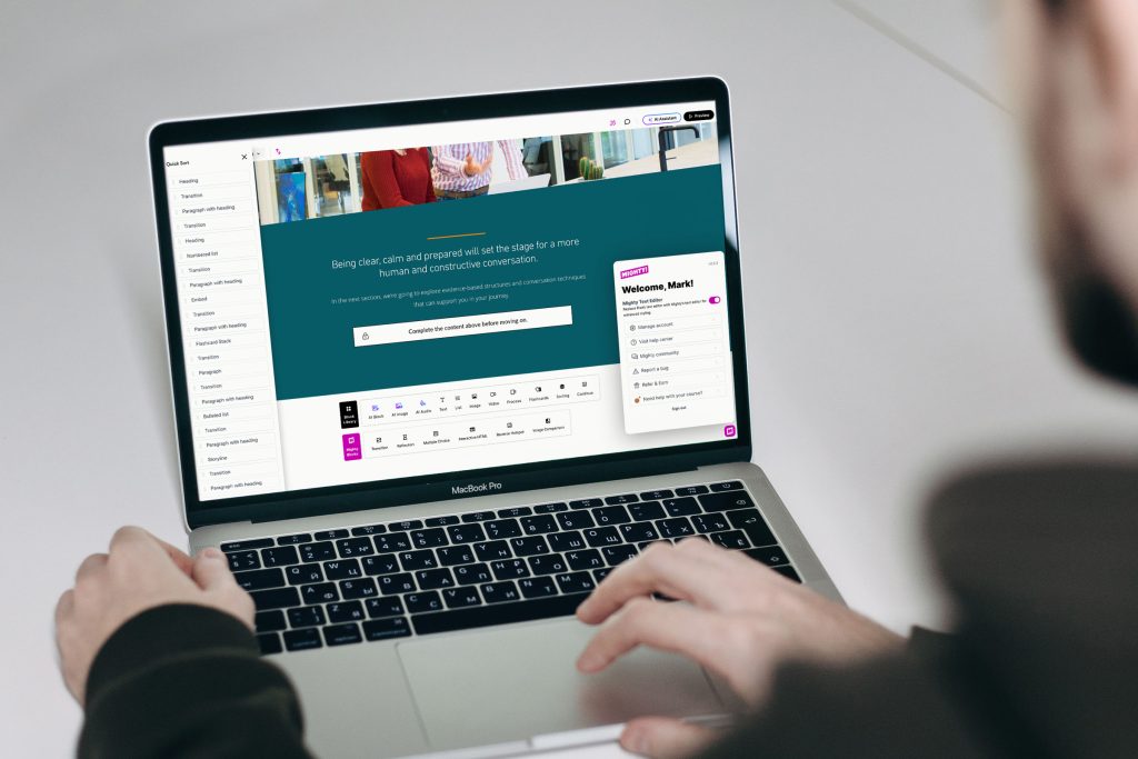
  • Quick sort: Faster, more effective means of relocating sections within your course.

No extra software is needed. It all runs inside your normal browser.

In short, Mighty turns Rise from a rapid authoring tool into a brandable design environment, giving you the creative freedom to make your learning look uniquely yours.

Costain Articulate Rise elearning

Why does it matter for brand?

Your brand doesn’t stop at your website or brochures, it should shine through in every learner experience. When people open your training, they should instantly recognise your look and feel.

Mighty helps you achieve that consistency. With its extra control over fonts, colours, and layouts, you can design learning that feels professional, polished, and unmistakably connected to your organisation.

For learners, that familiarity builds trust. For your brand, it adds credibility. And for your team, it proves that quick-build learning doesn’t have to look “off the shelf.”

How it works in practice

  • Install the extension in Chrome (or Edge).
  • Open Rise 360 – You’ll see new “Mighty” blocks and tools right alongside the standard Rise ones.
  • Build your course as normal, using the extra controls to tweak typography, colours, and transitions.
  • Publish your course – Learners don’t need the extension; all the custom styling is baked into the final output.

You still get all the speed of Rise’s rapid development, but with a much higher design standard.

Why do designers love it?

Mighty gives you the kind of creative flexibility that used to require a developer. You can:

  • Match your exact corporate fonts and colours.
  • Add elegant transitions between sections.
  • Use reflective or interactive blocks to increase engagement.
  • Bring a sense of motion and flow that standard Rise sometimes lacks.

It’s simple enough to use, yet powerful enough to make a noticeable visual difference.

Things to keep in mind

Like most good tools, Mighty isn’t free. It’s a paid extension (around $47/month or $337/year per user, with discounts for annual plans).

If your subscription ends, your published courses will still run fine, but you won’t be able to edit Mighty-specific elements until you renew.

And while it simplifies design tweaks, it still relies on good design judgement. Colour balance, accessibility, and clarity still matter just as much as new features.

Articulate Rise Mighty

Always evolving

One thing users appreciate about Mighty is how actively it’s being developed. New features roll out regularly, often every few weeks or months rather than once a year.

The current version (6.6.3) was released in November 2025, and Maestro even runs an Early Access programme so users can test and give feedback on upcoming tools before they’re public.

Sign up for early access

What to keep an eye on

While the team hasn’t published a full public roadmap, here’s what’s likely on the horizon:

  • Advanced scripting and “Power-ups” for more custom behaviours.
  • New block types for branching, scenarios, and more animation options.
  • Improved collaboration tools for teams sharing templates or reviewing builds.
  • Better localisation and accessibility options (such as right-to-left layouts).
  • Enhanced analytics and tracking for deeper learner insights.

The takeaway

Mighty gives learning teams a practical way to make Rise courses look modern, branded, and engaging, all without slowing down the build process.

For anyone who loves Rise but has ever thought, “I wish I could just tweak this one thing,” Mighty is that missing piece.

It’s a simple, powerful way to elevate your design, turning quick courses into custom, on-brand experiences that truly stand out.

As experts in Articulate 360 (Rise and Storyline) elearning design and development, Eggu are the perfect partner to roll out your custom-created branded learning experiences, or support to enhance the work of your in-house digital learning teams.

Get in touch with Eggu about your next Rise project.

Elevating digital learning design: The new Rise 360 updates

In digital learning, one of the biggest challenges has always been finding the sweet spot between speed, creativity, and brand identity.

We all want courses that look great, feel consistent with our organisation’s style, and are quick to build and update. But in the past, those goals didn’t always go hand in hand.

Tools like Articulate Rise 360 made course creation fast and accessible, but often at the cost of design individuality.

You could build great learning quickly, but it sometimes looked like, well… everyone else’s.

Thankfully, that’s now changing – and fast.

Over the past year, Rise has introduced a wave of new design features that give learning teams far more creative freedom. You can now build digital learning that doesn’t just work beautifully on any device, but also looks and feels like your brand.

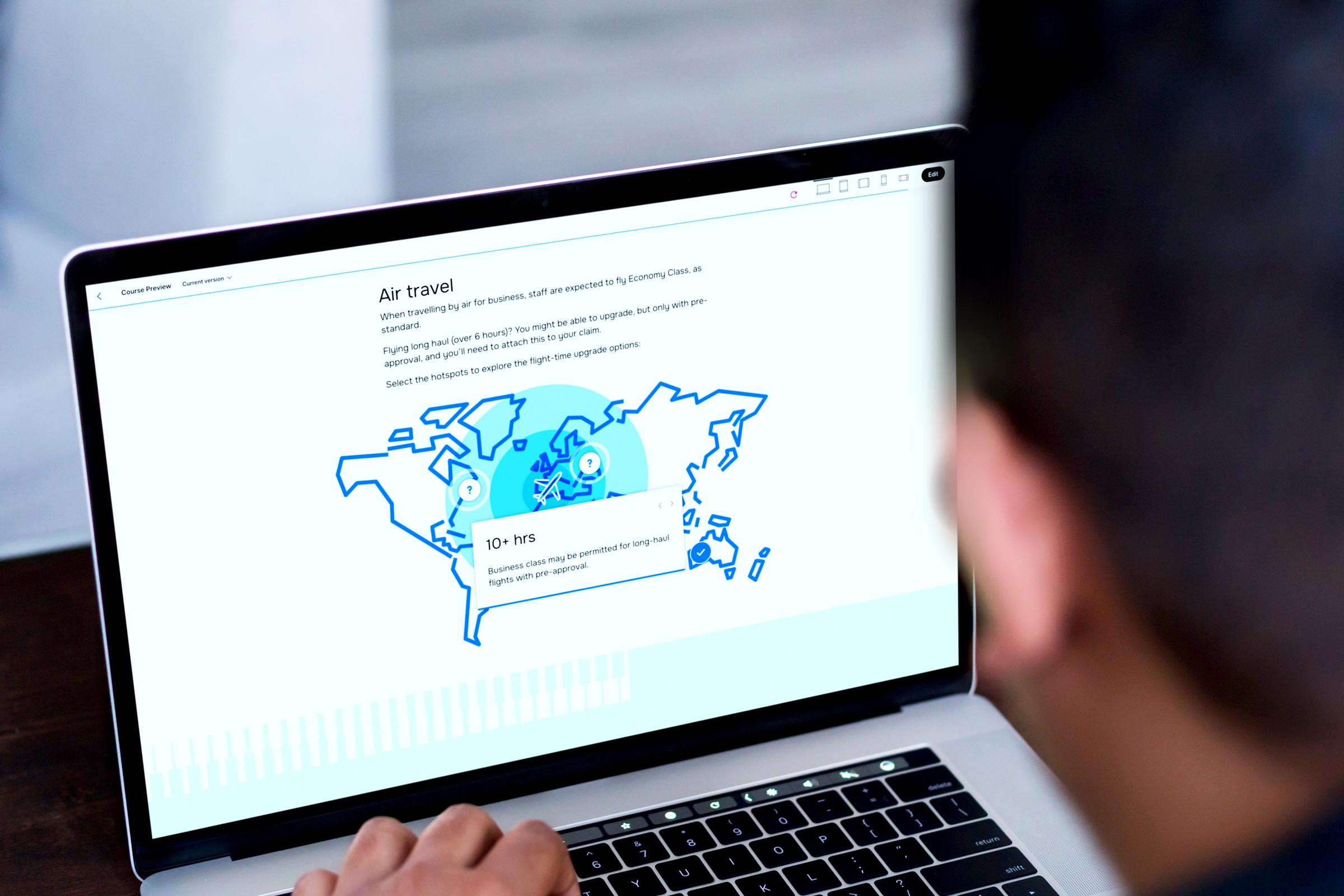
RELX Articulate Rise Elearning

More freedom to make it your own

One of the biggest and most exciting changes is custom themes. Rise now offers stylish layouts like Apex and Horizon, which you can tweak to match your organisation’s colours, fonts, and navigation style.

It means your courses can finally look like your brand — not just generic templates. With just a few clicks, you can align buttons, headers, and menus with your visual identity, so learners instantly recognise who the course is from.

And best of all? You don’t need to touch a single line of code.

A smoother, more polished look

Small design details make a big difference. Rise’s improved font and text controls make it easier to apply your chosen typefaces consistently across the whole course – keeping everything neat, readable, and on-brand.

It’s a subtle upgrade that helps courses look more professional and cohesive – the kind of polish that learners might not consciously notice, but absolutely feel.

More ways to bring content to life

Rise also gives you more creative control over how content appears on screen. You can now use:

  • Background images and colours to break up sections
  • Different header styles to create emphasis
  • Gentle animations to add flow and visual interest

All of this adds personality to your learning without slowing down production. You can create courses that are clean, modern, and visually engaging — without needing a graphic designer or developer to get involved.

Designed for global teams

If you’re rolling out learning to people across different regions, you’ll love Rise’s improved translation and localisation features.

You can export your text for translation and easily import it back in – no rebuilding required. Rise even supports right-to-left languages like Arabic and Hebrew and automatically adjusts layouts to suit different text lengths.

That means your course design stays consistent, no matter what language it’s in.

Easier editing for busy teams

Behind the scenes, Rise has also improved its text editing tools, making formatting faster and more reliable. It’s the kind of behind-the-curtain upgrade that makes everyday authoring smoother, especially when you’re juggling multiple modules or working with several contributors.

Why do these updates matter?

Learners might not always think about why a course looks professional or polished, but they definitely notice when it doesn’t.

A well-designed, brand-aligned learning experience builds trust and keeps people engaged. It tells your audience, this matters – and so do you.

These updates mean that learning teams can now:

  • Build faster without sacrificing creativity
  • Keep every course visually consistent with the wider brand
  • Deliver a more polished, engaging learner experience
  • Spend less time fixing formatting and more time creating great content

A new era for learning design

What’s exciting about all of this is that the gap between “template-based” and “custom-built” learning is closing.

With the new Rise 360, teams no longer have to choose between beautiful design and quick turnaround. You can have both – scalable learning that looks as good as it performs.

In short, Rise now makes it possible to build learning that’s fast, flexible, and unmistakably yours.

And with new tools like Mighty – a Chrome browser extension created by Maestro Learning that plugs straight into your normal Rise 360 workflow – you can add even more design options, new content blocks, and take more creative control.

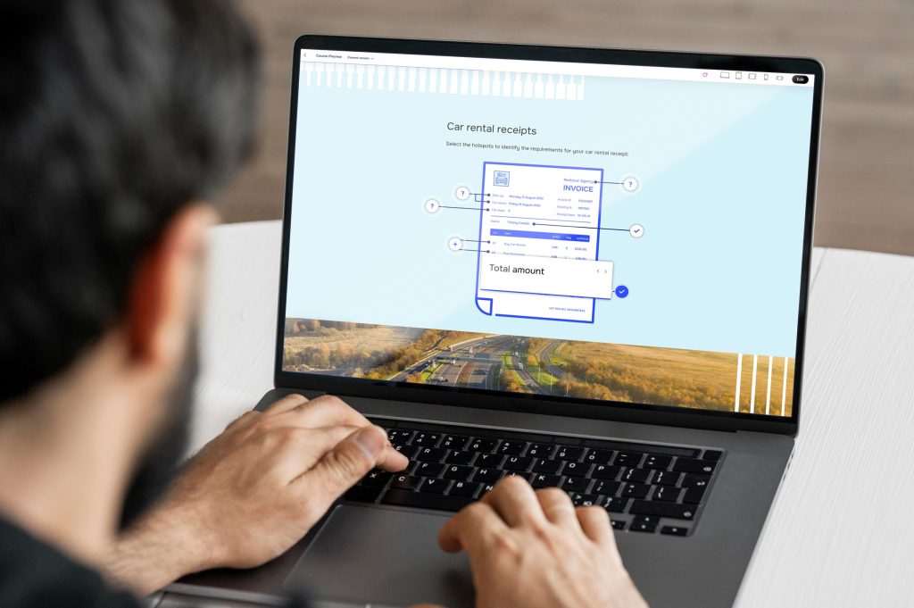
RELX Articulate Rise Elearning

Looking ahead

As digital learning continues to evolve, design quality is becoming just as important as content quality. Learners expect engaging, visually appealing experiences. And now, tools like Rise make that easier than ever to deliver, in multiple languages too.

It’s a big win for L&D teams, designers, and learners alike. Courses that are faster to build, easier to manage, and a whole lot more enjoyable to experience.

As experts in Articulate 360 (Rise and Storyline) elearning design and development, Eggu are the perfect partner to roll out your custom-created branded learning experiences, or support to enhance the work of your in-house digital learning teams.

Get in touch with Eggu about your next Rise project.

Frightfully good learning: Avoiding the scariest mistakes in elearning design

As Halloween creeps closer, it’s the perfect time to face the monsters lurking in your digital learning library.

Great learning should raise spirits, not the dead.

If your digital learning feels more frightful than delightful, here are three classic horror villains you might recognise…


Eggu Halloween Zombie

1. The Zombie

Lifeless, repetitive content that won’t die

This course staggers on year after year — recycled slides, endless clicking, no spark. Learners go through the motions, but nothing sticks.

The symptoms

  • Resurrected PowerPoint style content
  • Walls of text that drain the life from learners
  • Learning objectives that haven’t changed since last Halloween

How to fight it

Resuscitate your content by injecting the cure – focus on real-world scenarios, add storytelling, quick interactive challenges, catchy visuals, or actual voices from your audience. Fresh context makes familiar topics come alive again.


2. The Vampire

Drains all enthusiasm from learners

This course might look slick – shiny graphics, smooth voiceover – but behind the polish, it’s sucking the energy out of everyone who goes near it.

Eggu Halloween Vampire

The symptoms

  • Learners click “next” faster than you can say “bloodsucker”
  • No emotional spark – just endless instruction
  • It talks at learners, never with them

How to fight it

Add warmth and humanity by designing with empathy. Use a conversational tone and relatable scenarios. Cut the jargon and make space for reflection or humour – even compliance training deserves a heartbeat!


Eggu Halloween Ghost

3. The Ghost

Vanishes after launch

You launched the course. Everyone completed it…then nothing. No buzz, no feedback – just a deathly silence. 

The symptoms

  • No follow-up or discussion after completion
  • No visible behaviour change
  • Lost in LMS reports and annual review, never to be seen again

How to fight it

Learning shouldn’t end at the final quiz. Plan for post-launch existence – follow-up nudges, reflection prompts and managers’ conversations will keep it alive.

Escaping these horrors doesn’t take magic – just mindful design

Make sure to start with purpose, ask yourself “What problem are we solving?”. Designing for actual challenges and not just sticking to a generic course outline will keep the learning ‘people focussed’. To keep it interesting and appealing; review regularly, refresh and rebuild the content and design to give the course energy and relevance. Breathe life into it before it gets frighteningly dull!

Truly good learning doesn’t scare learners away, it draws them in, keeps them curious, and leaves a lingering impression. 

Check out our top ‘tricks’ to keep your digital learning fright-free this halloween:

  • Keep it alive: Refresh stale content and design before it becomes a mindless shuffle
  • Resurrect engagement: Design for humans, not content checkboxes – connect with your learners
  • Cast your spells wisely: Use empathy and storytelling to enchant your learners
  • Don’t be invisible: Follow up after launch so learning doesn’t vanish without a trace
  • Stay vigilant to scares: Revive dated courses to energise learners

Happy Halloween from EgguGet in touch to slay your elearning demons!

BBC Bedtime Stories: A blueprint for effective digital learning

The BBC Bedtime Stories format has evolved into a delightful model for learning that is both engaging and educational.

Since 2017, the series initially gained popularity with its charming and soothing approach to storytelling, aimed at helping both children and adults calmly wind down before bed.

Over time, it has expanded its reach, with well-known personalities and celebrities lending their voices to the narration, making it even more engaging for listeners.

But what can we take from this clever, simplistic format to inspire our leaning styles and techniques to engage audiences of any age?

Here’s why BBC Bedtime Stories is a great structure for bite-sized learning:

BBC Bedtime Stories Steve Carrell

Concise and digestible

Each episode of BBC Bedtime Stories typically runs between 10 to 20 minutes, offering a perfect length for digestible content.

In a world where attention spans are shrinking, the short yet impactful duration of the stories ensures that listeners can focus without feeling overwhelmed. This bite-sized approach mirrors the needs of modern learners who want quick, meaningful insights without committing to long hours of content.

Engaging and immersive

Storytelling is one of the oldest and most effective ways to convey information.

Narrative-driven learning creates an emotional connection, making the content not only memorable but also enjoyable. This engagement factor makes learning more appealing and helps keep the learner invested.

It’s about sparking curiosity and motivating the listener to continue learning, even after the session ends.

Tone and pace

The tone of the narrators is consistently soft, warm, and calming ensuring that the listener is enveloped in a comforting and familiar atmosphere.

The narrators often employ a slow, deliberate pace, with strategic pauses that give the listener time to absorb the story.

BBC Bedtime Stories Dolly Parton

Design and delivery

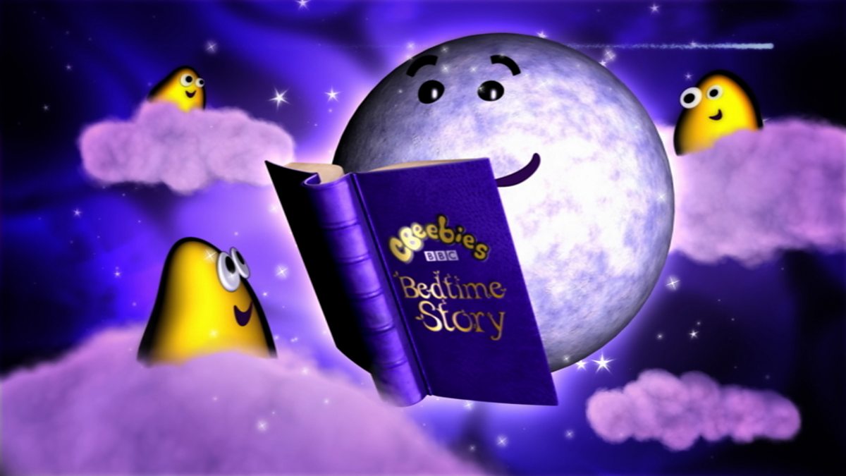
The visuals in BBC Bedtime Stories are deliberately simple, aligning with the core objective of creating a tranquil, peaceful atmosphere for the listener.

This minimalist approach avoids overstimulation, allowing the audience to focus solely on the content and engage with the experience without unnecessary distractions.

One of the key features of the visual style is how it effectively integrates real pages from storybooks. The illustrations are often the focal Pages are often scanned and displayed to give a sense of authenticity and immersion, reinforcing the traditional bedtime reading ritual.

Consistency and routine

BBC Bedtime Stories are typically delivered as a regular feature, creating a sense of routine. Consistency is a key factor in any effective learning strategy.

When bite-sized lessons are incorporated into a daily or weekly habit, learners are more likely to form lasting connections with the material. Regular short learning sessions help to reinforce concepts over time and prevent the overload of information that often accompanies longer, more traditional learning formats.

Just as we can easily incorporate a nightly bedtime story into our routine, integrating bite-sized learning sessions into a daily or weekly schedule can create a similar positive, reinforcing habit. Over time, this structured repetition can improve long-term retention.

Summing up

In an era where digital learning is evolving at a rapid pace, finding formats that make learning engaging, accessible, and effective is crucial.

BBC Bedtime Stories offers an inspiring model of bite-sized learning that sets a standard for how digital learning can be more than just information delivery — it can be an experience.

If you’re interested in bringing creativity and design to your next digital learning project, get in touch with Eggu to chat through your needs.

The role of 3D animation in video tutorials

3D animation is transforming the way video tutorials educate and engage audiences.

By adding depth, realism, and interactivity, it enhances learning experiences across industries.

Here’s our five reasons how:

1. Simplifying complex concepts

3D animations can break down intricate subjects into digestible visuals. Whether explaining medical procedures, engineering mechanics, or software interfaces, 3D visuals provide clear, step-by-step demonstrations that improve learner understanding.

2. Increasing engagement and retention

Dynamic animations capture the viewer’s attention better than static images or traditional videos. Studies show that learners retain more information when visuals are engaging and interactive, making 3D animation a valuable tool for educational content.

3. Enhancing brand identity and aesthetics

For businesses creating tutorials, 3D animation helps maintain a unique, high-quality and professional delivery. Custom animations work to align with a client’s brand guidelines and aesthetics, ensuring a polished and recognisable visual identity.

4. Supporting interactive and immersive learning

With the rise of VR (Virtual Reality) and AR (Augmented Reality), 3D animations enable immersive learning experiences. Users can interact with animated objects, explore 360-degree views, and engage with content in an interactive manner.

5. Enabling global accessibility

Since 3D animations rely on visuals rather than text-heavy explanations, they help bridge language barriers. Tutorials with animated explanations can reach a broader audience worldwide without extensive localisation.

Summing up

3D animation is revolutionising video tutorials by making learning more engaging, accessible, and effective. From corporate training to educational courses and product demonstrations, it plays a crucial role in enhancing comprehension and retention. As technology evolves, its role in digital learning will only continue to grow.

If you’re interested in using 3D animation to bring your next digital learning project to life, get in touch with Eggu to chat through your needs.

Why bespoke illustrations are replacing stock imagery in digital learning

We’ve all heard the saying, “A picture is worth a thousand words.” In today’s digital age, this couldn’t be more relevant.

According to Neilson, 70% of social media prefer to engage with visuals rather than text-heavy content.

However, the nature of these visuals is changing. More brands are moving away from generic stock imagery and embracing bespoke illustrations to enhance their visual identity and create stronger, more authentic connections with their audience.

The decline of stock imagery

Stock images have long been the go-to solution for brands and designers needing quick, high-quality visuals. They can work fantastically, but do come with some significant drawbacks.

While stock images offer convenience and cost savings, they often lack uniqueness. Many stock images appear on multiple websites, making them feel generic and uninspired. This can dilute a brand’s individuality and impact.

Stock images rarely align perfectly with a brand’s unique messaging and can often fail to capture a brand’s specific essence. This makes it difficult to create a consistent and authentic visual identity.

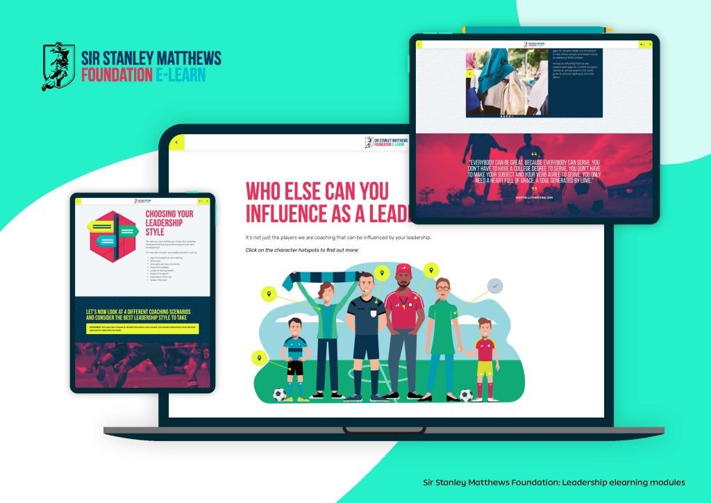
Sir Stanley Matthews Foundation elearning

The rise of bespoke illustrations

Custom illustrations offer a fresh alternative, providing a host of advantages that help brands stand out in a crowded digital space:

Boost brand identity

Bespoke illustrations are becoming a cornerstone for brands aiming to stand out, reflecting their unique identity and values.

Custom illustrations align perfectly with a brand’s aesthetic, reinforcing its identity and making it more memorable.

For e-learning platforms and online courses, bespoke illustrations help maintain a cohesive and professional look, strengthening brand identity and making courses more recognizable.

Personalising learning experiences

Unlike stock images, illustrations offer limitless creative possibilities, enabling brands to tell their story in a unique and engaging way.

Unlike stock images, custom illustrations can be tailored to match different learning styles and demographics, making educational content more relatable and inclusive. This fosters a deeper connection between the learner and the material.

Simplifying complex information

Bespoke illustrations can break down difficult topics into digestible, easy-to-understand visuals, improving comprehension.

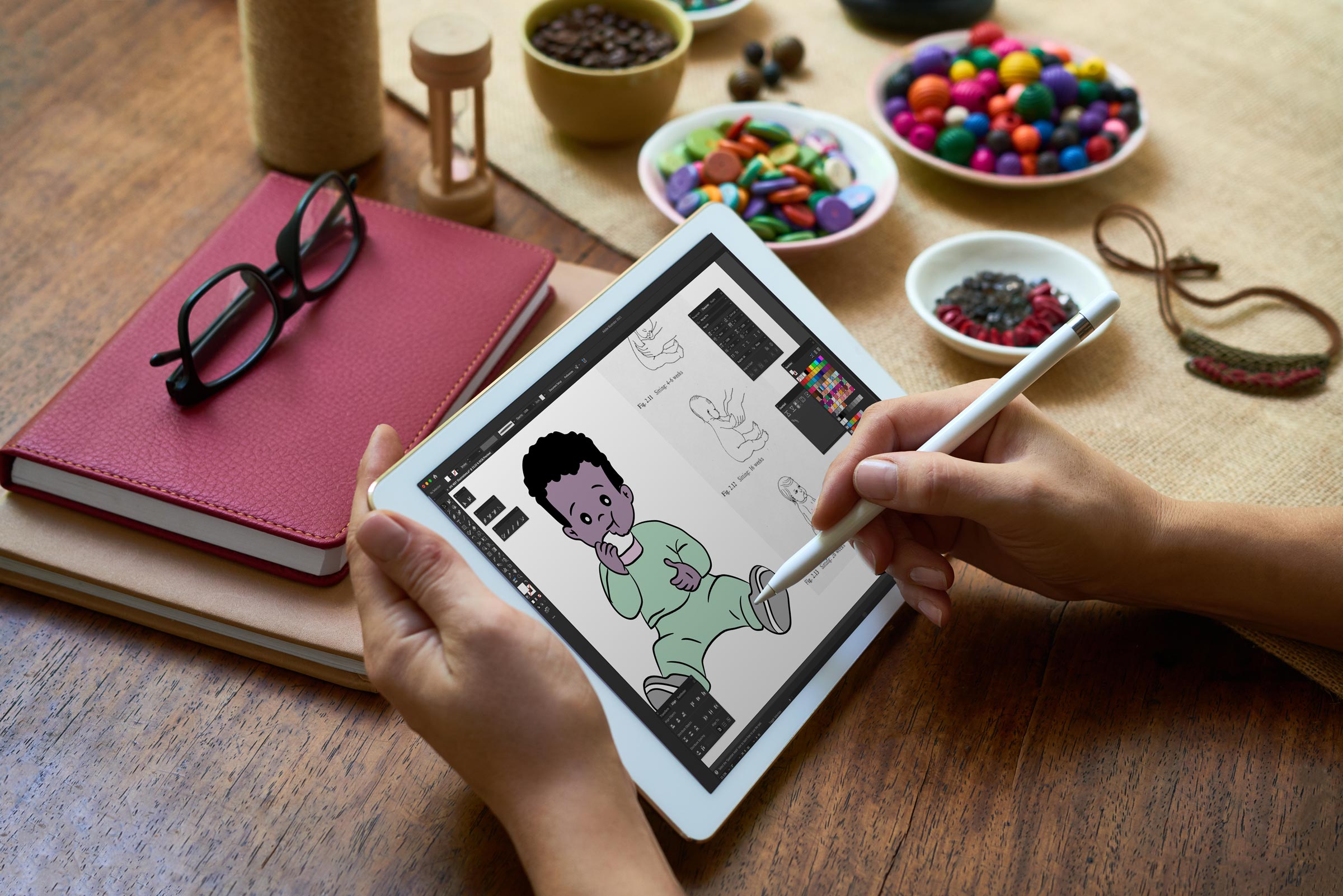
Bespoke digital illustrations for iHV being created

Enhancing interactivity

Illustrations can be incorporated into interactive infographics, gamified elements, and digital storytelling to make learning more dynamic and immersive. Animated illustrations can also be used in explainer videos to enhance understanding.

Improved user experience

Illustrations integrated within digital learning can guide users through content seamlessly, improve navigation, and increase engagement.

Custom illustrations make learning materials visually appealing and interactive, capturing learners’ attention and helping them retain information more effectively. Visuals simplify complex concepts and make abstract ideas more tangible.

Visually appealing content reduces cognitive overload and makes learning more enjoyable. Students are more likely to stay engaged when presented with creative and thoughtfully designed illustrations.

A shift towards inclusivity and diversity

One of the most significant recent visual trends is the emphasis on inclusivity and diversity. Brands are no longer relying on one-size-fits-all imagery; instead, they are commissioning illustrations that authentically represent a diverse range of ethnicities, body types, genders, and lifestyles.

Custom visuals can depict diverse characters, scenarios, and learning environments, ensuring inclusivity and representation in digital learning materials. This is especially important for global audiences.

This shift is not just a moral imperative — it’s also good business. In the UK, 64% of consumers expect companies to take a stand on social issues, including representation and inclusivity.

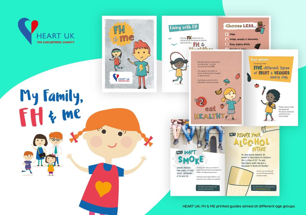
HEART UK bespoke booklet illustration designs

The future of visual storytelling

In a world where digital users crave authenticity, brands must move beyond stock imagery and embrace the limitless possibilities of bespoke illustrations.

Whether it’s through whimsical graphics, bold artistic statements, or hand-drawn elements that reflect real-world diversity, bespoke illustrations allow brands to forge deeper, more meaningful connections with their audience.

The future of digital learning design lies in crafting engaging, visually compelling stories – and custom illustrations are the key to unlocking that potential.

If you’re looking for bespoke illustrations to bring your next digital learning project or marketing campaign to life, get in touch with Eggu to chat through your needs.

Learning Technologies Awards 2022 – We’ve been Shortlisted!

We’ve been shortlisted for the Learning Technologies Awards 2022 in the category of Excellence in the ‘Design of Learning Content – Public & Non Profit Sector’ for our work with the incredible Brook.

The Learning Technologies Awards are the most sought-after awards in the Industry, recognising the commitment, enthusiasm and passion for learning technologies across the world. Finalists are selected by our independent judging panel of experts organised by the Learning Network.

We’ll be anxiously awaiting the winners’ announcement at the Awards on 16th November, but in the meantime you can have a look at our project case study here:

As a boutique digital elearning agency, this is a big deal to us. We’re so proud to be shortlisted for Excellence in Design, which represents our commitment to being the best we possibly can do, and achieving brilliant results, delivering real change for our clients. 

Keep your fingers crossed, we’ll let you know when we do!