As a team who works as an extension of our clients’ teams in the non-profit and healthcare sectors, we’ve undoubtedly all experienced the challenges of 2023 together.
Budgets have become more restricted, whilst the demand for services have soared. It’s been a bumpy ride.
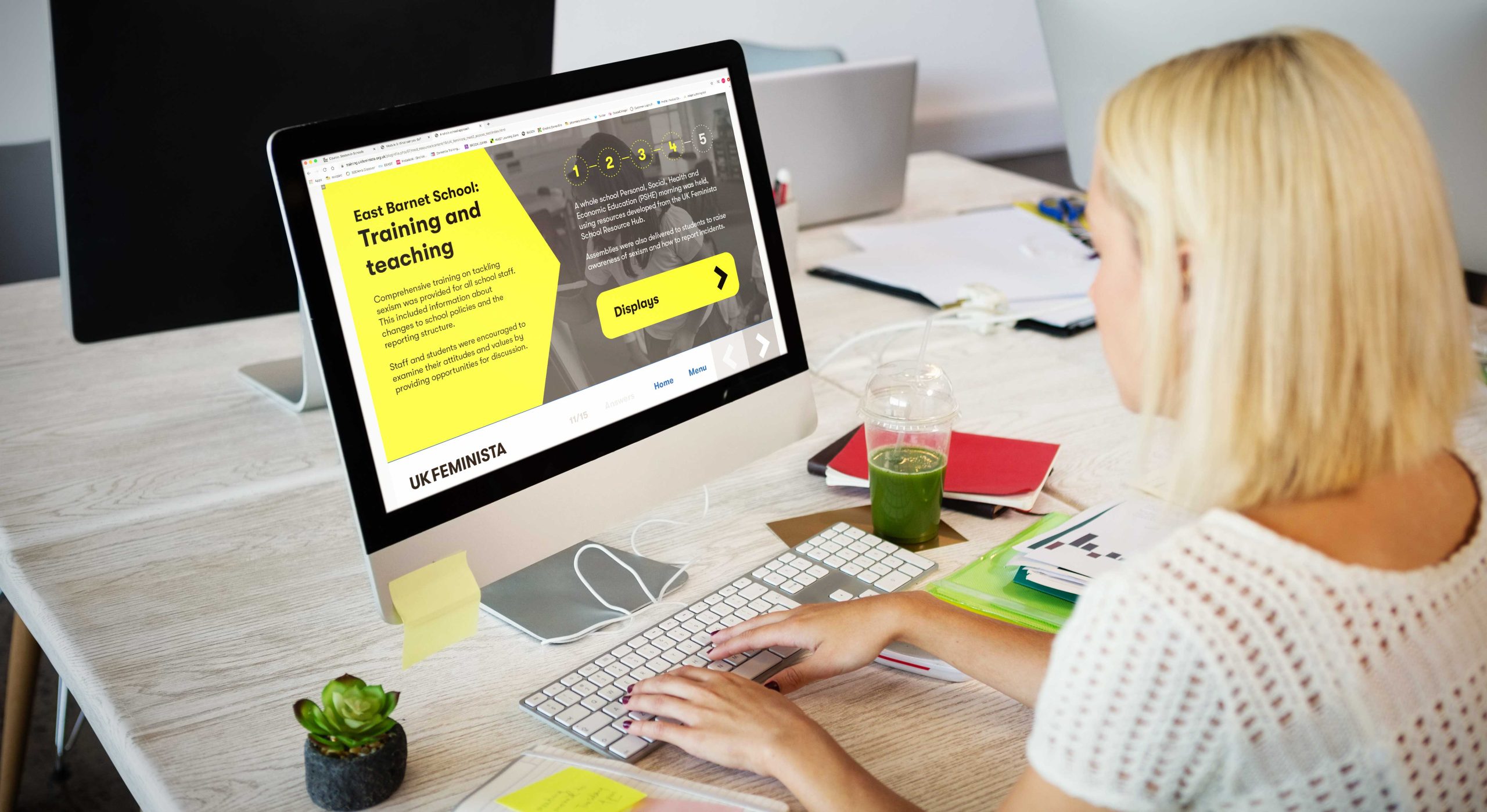
But, what has emerged this year, is that more than ever, the spotlight is now firmly on digital learning, with many more charities and non-profits exploring its versatility as not only a means to provide access to a wider audience of learners, but also a force to greatly amplify their brand voice and impact much beyond their budget and scale.

Digital resilience
We know charities are creative, innovative and resilient, it’s in their nature.
In 2024, we feel this will mean embracing digital in all its glory, joining the digital dots to create a bigger, more unified and impactful message, and using digital platforms to amplify that message like never before, and in a way that can help create a more passive and sustainable income stream to support their growth objectives.
So, here are our predictions for the digital learning trends for 2024.
Gaming for good
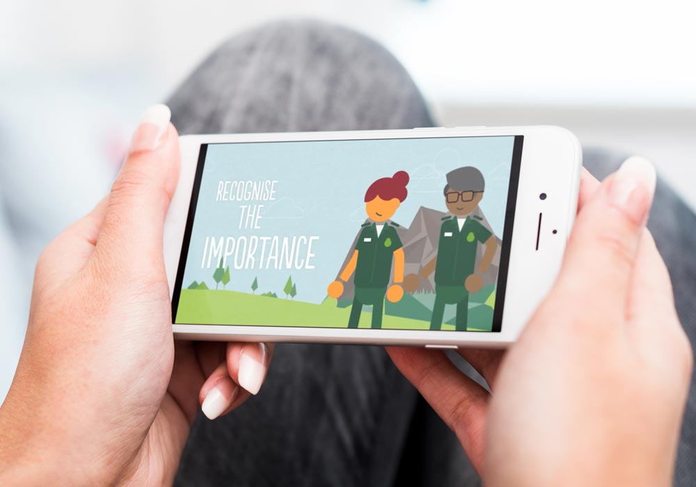
The use of VR and AR can help create immersive learning experiences, allowing learners to step into virtual situations. This kind of learning is memorable and helps build an understanding of and alignment with the people they seek to support.
The downside to VR and AR is that this may be out of reach because of high costs to develop, however using video and animation can be a great, more cost-effective way to turn educational content into storytelling, or simulations to educate learners and keep them actively involved in the learning process without investing heavily in VR.
You can see a sample of our work in digital learning, animation and video in our Eggu showreel.
AI
The landscape of digital learning is continually evolving, and as we step into 2024, Artificial Intelligence (AI) stands as a transformative force within digital learning.
Although its impact on content generation has sparked debates among educators and industry stakeholders around the elimination of human creativity, its speed and efficiency can provide a free and effective additional resource to generate outline learning ideas, structure content and break down language barriers.
User-centred experiences
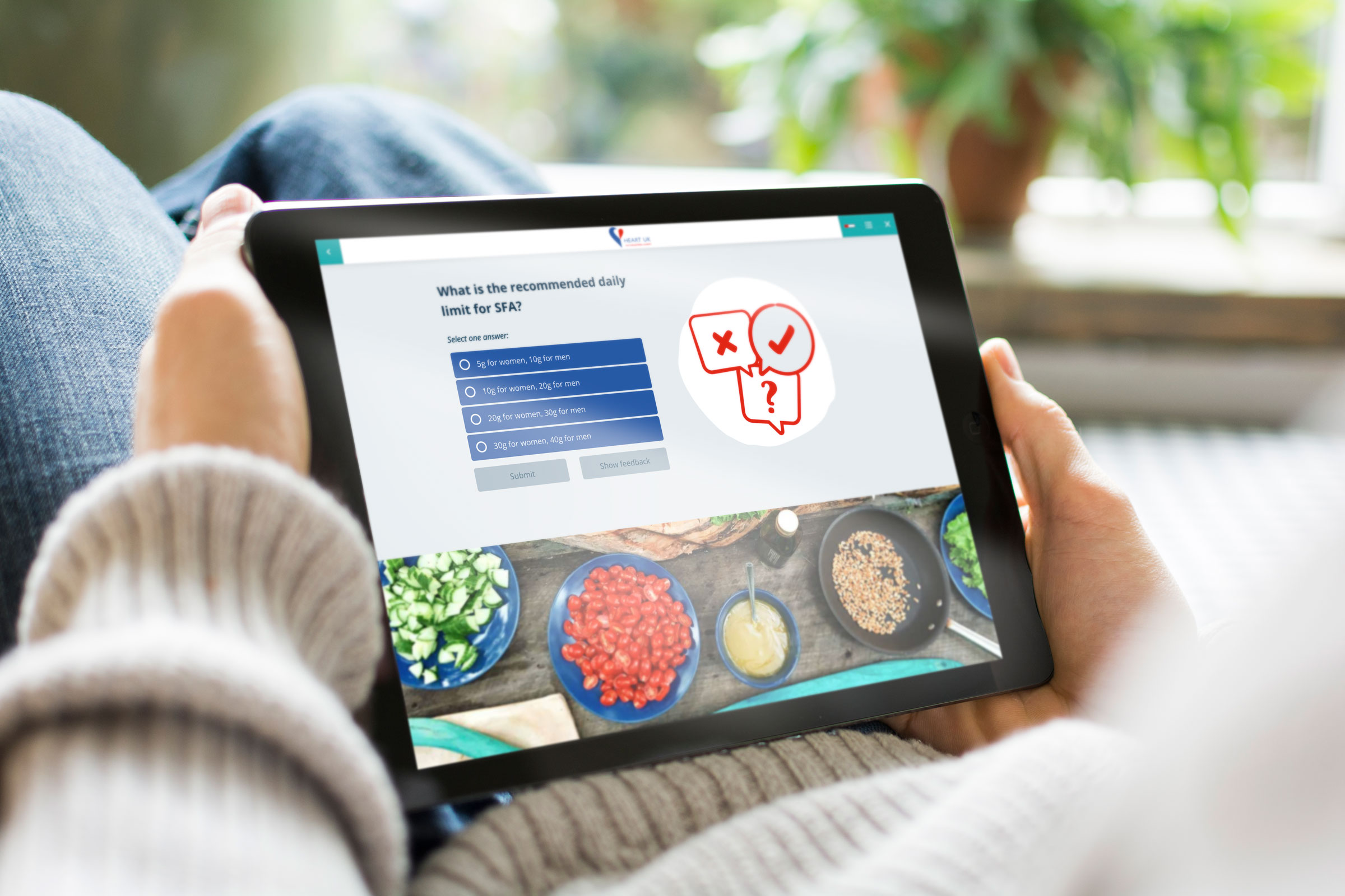
Digital learning gives us so much opportunity to better understand our learners, and to create a unique and tailored learning experience, but at the moment our reporting is most widely used to track enrolments and completion rates.
By further enhancing our analytics of how our learners engage, we can truly create tailored and intuitive digital learning. In 2024, we should all be looking to create more user-centred learning by using the data we have available.
Accessibility
Accessibility needs to be embedded in everything we do, and as a sector we should be leading the way. In 2024, accessibility should mean everyone can access digital learning, and that every piece of learning content should be accessible. It’s something we feel so passionate about, we’ve assigned our own internal accessibility champion to review and ensure accessibility best-practice for everything we do.
For more information, why not start our four-part mini-series on how to create accessible digital learning?
Micro-learning
When focus and time is at a minimum, bite-sized, easily digestible content is key to a successful digital learning program, which can engage learners wherever and wherever it suits them. In a time when the majority of people are now home based, this is also key to company-wide training initiatives.
Not only will this help your digital learning to reach more remote learners, it’s also critical to organisations who need to train on the move, like our range of ambulance service clients, when rolling out urgent training during the Covid 19 Pandemic.
Why not check out more about our work and game-changing projects with charities and health-based organisations in our cracking digital learning guide?
You can also take a look at our demo micro-learning course, all about Eggu, to see how it works in action.
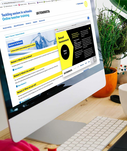
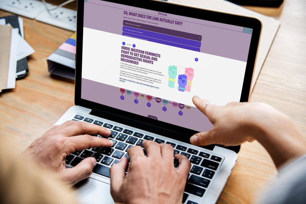
Innovation in Action: Brook Learn
We’ve proudly worked with leading sexual health charity, Brook over the last 8 years. Over that time we’ve developed their digital learning to include an award-winning digital course on Consent, designed bespoke animations to support them to lobby the government over sexual health policies and we host the Brook Learn platform, which houses a range of online training courses, resources, animations and videos for teachers to support the delivery of effective relationships and sex education (RSE) in schools.
Year on year, we have seen a consistent increase in engagement with Brook Learn. Today, we now have over 32,000 users registered, and the rate of growth continues to rise. Now Brook can easily track user activity data, which demonstrates an increase in user knowledge and confidence after completing Brook digital learning, with the majority of users ranking the online training as easy to access, useful, relevant, engaging and well-structured.
Brook Learn has not only helped to build brand awareness but has introduced the charity to whole new markets, with users in almost all local authority areas in the UK.
It has unlocked the opportunity to develop paid for content and market new education products to a growing list of subscribers. The latest figures for 2021-22 show that 36% of educational income at Brook has come from digital products developed with Eggu.
“ The digital learning we’ve created together over the last eight years is changing young people’s lives – that’s no easy task.”
Laura Hamzic, Director of Digital and Communications
Brook
You can find out more about some of our recent projects with Brook in the following blogs:
Eggu is ready to push the boundaries, and create change
Let’s get cracking.