Every March, B Corp Month celebrates businesses that are truly purpose-driven – organisations committed to social and environmental impact, not just profit.
Not just big statements. Real action.
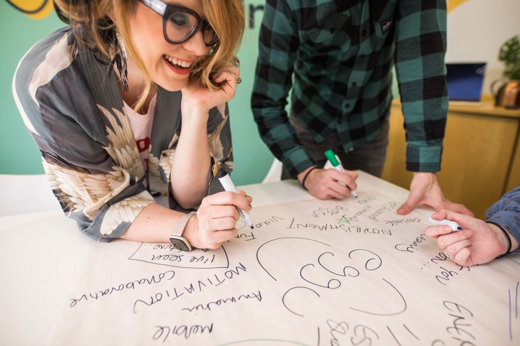
At Eggu, that’s exactly why we love working with B Corps.
Purpose doesn’t live in a logo, it lives in what people do every day. Effective digital learning is one of the most powerful ways to turn purpose into action across your organisation.
Creativity: Make purpose engaging
Let’s be honest, company values and purpose can sometimes feel…a bit fluffy.
That’s where creative, design-led learning makes all the difference.
We turn complex ideas like sustainability, inclusion and ethical decision-making into engaging, interactive learning experiences that people actually want to take part in. The result? Employees who understand your mission and feel motivated to act on it.
When learning grabs attention, it sticks. And when it sticks, it drives behaviour change.
Transformation: Turn values into everyday actions
Purpose-driven organisations don’t just want awareness, they want transformation.
We create bespoke digital learning that shifts mindsets and behaviours, helping people make better decisions aligned with your company’s purpose. Whether it’s ESG goals, sustainability initiatives or inclusive workplace practices, learning gives your teams the confidence to act.
That’s when the magic happens; when company values stop being words and start to become habits.
Impact: Drive measurable change
You don’t need to be a huge organisation to create meaningful impact. Like the humble egg, we might be small, but we pack a punch.
Our digital learning solutions help organisations scale impact by embedding purpose into everyday decisions. Small actions repeated across teams, roles and locations quickly build into measurable change.
Purpose-driven businesses create lasting impact. Not in one big moment, but through consistent, daily actions.
Collaboration: Build purpose led learning
The best learning experiences don’t happen in isolation, they’re built through collaboration.
We work closely with organisations to design and deliver custom digital learning that reflects their mission, culture and goals. From concept to launch, we integrate seamlessly with your team to create learning that truly resonates.
When creativity and purpose come together, the results are powerful.
Final thought: Learning provides purpose
B Corp Month is a reminder that real impact comes from people. People who understand your mission and feel empowered to act on it.
That’s where learning comes in.
At Eggu, we specialise in creating creative, impactful digital learning that helps purpose-driven organisations bring their values to life, strengthen culture, and drive meaningful change.
Because purpose isn’t just something you say, it’s something your people do.
If you’re wanting to develop a digital learning project, we’d love to explore it with you.
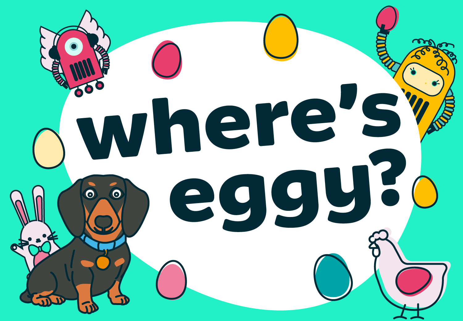
This Easter, we’re inviting you into a world of chocolate, colour, and just a little bit of chaos.
Welcome to Eggu’s very own Easter Egg Factory – a bespoke illustrated scene (designed by our very own Millie) packed with delicious details, hidden surprises, and one very important mission:
Find Eggy!
Eggy, our much-loved office sausage dog, has snuck into the factory and is hiding somewhere amongst the Easter treats.
Your challenge is to track him down using grid coordinates and submit your answer for a chance to win a £25 voucher for Waitrose or John Lewis. (A great opportunity to stock up on those Easter eggs!)
So whether you’re in it for the glory, the prize, or just the satisfaction of spotting a very well-hidden dachshund – we’re excited to see who finds him first.
Ready to play?
Take a closer look at the Eggu Easter Egg Factory, sharpen your eyes, and start searching. You’ll see that we’ve even added a helpful magnifier when hovering over the image.
A bit about Eggu
At Eggu, we design experiences that people don’t just complete – they enjoy. From playful campaigns like this to fully interactive learning solutions, we help organisations turn content into something memorable, meaningful, and engaging.
Enter our Easter competition
Last entries – Monday 6th April
If you’d like to explore how we can bring this kind of thinking into your digital learning, we’d love to chat.
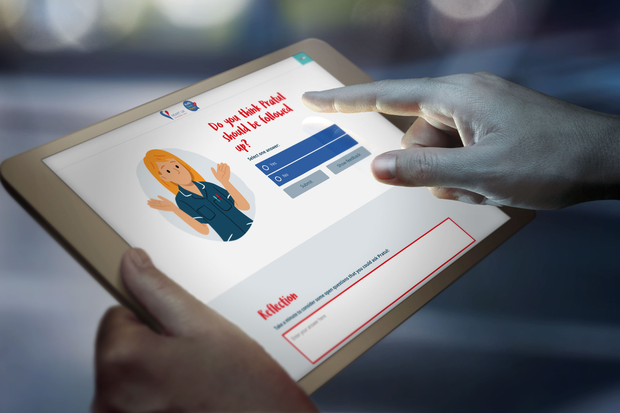
As we approach the end of the financial year, many local authorities are reviewing how best to allocate remaining budget while planning ahead for the year to come.
Health Check Mentor offers a practical, cost-effective way to strengthen the training and quality assurance of your NHS Health Check workforce.
With an annual subscription model, the programme can cost as little as £33 per GP practice per year, with unlimited user enrolments across your region.
Commissioned by 20+ local authorities and used to train over 4,000 practitioners, Health Check Mentor supports safe, confident and consistent delivery of NHS Health Checks.
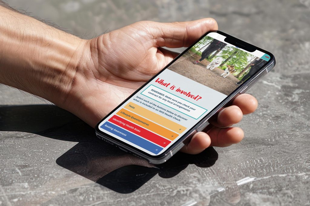
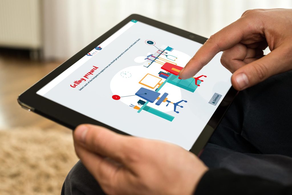
What Health Check Mentor provides
Cost-effective annual subscription
Rapid deployment – live within weeks
Regular updates aligned with national guidance
Built-in compliance reporting for commissioners
Flexible, bite-sized learning for busy frontline staff
In this session, Jules Payne, Michaela Nuttall and Kat Baldwin:
✨ Share the history and impact of Health Check Mentor ✨ Explore the benefits for both learners and commissioners ✨ Demonstrate the platform in full ✨ Outline flexible commissioning options
If you’re reviewing your workforce development offer, now could be the ideal time to adopt a solution that reduces local training burden while strengthening quality and consistency.
Health Check Mentor offers commissioners a high-quality, low-cost, and low-maintenance solution that strengthens provider competence, reduces variation and supports improved population health outcomes.
If you’d like to:
Explore costs for your region
Arrange a demo account
Discuss commissioning options
Get in touch with the Eggu team for more information.
Get in touch for a full demonstration and tailored quotation for your region.
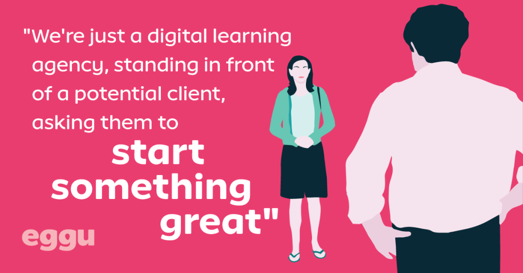
This Valentine’s Day has got us feeling a little flirty here at Eggu HQ.
Maybe it’s the heart-shaped chocolates. Maybe it’s the rom-com rewatches. Or maybe it’s because, when you really think about it, the best client–agency relationships have a lot in common with the greatest love stories of all time.
Elizabeth Bennet and Mr Darcy.
Baby Houseman and Johnny Castle.
Taylor Swift and Travis Kelce.
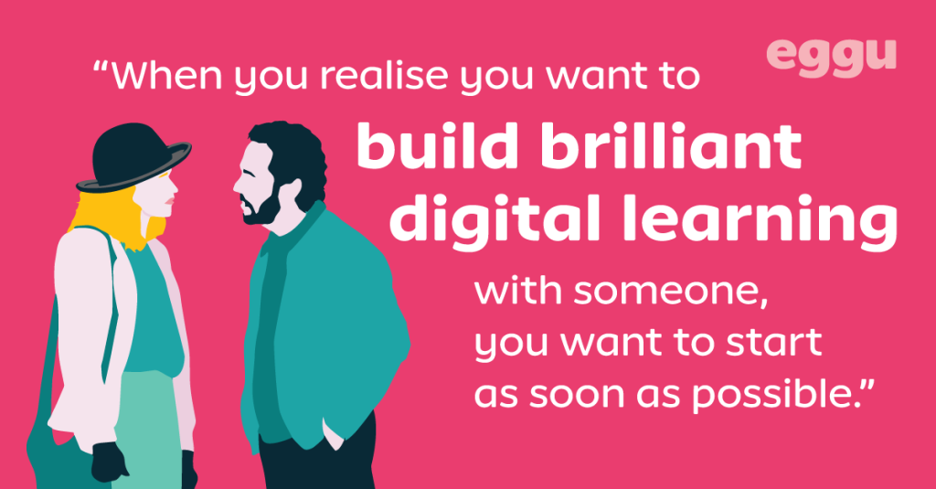
They’ve all shown us that the best partnerships (no flings here) are built on chemistry, trust, respect – and crucially showing up for each other in the right moment.
We’re looking for long-term relationships with bold, ambitious clients that are passionate about developing their people.
“Team work makes the dream work” is a cliché for a reason.
When clients and agencies collaborate openly, care about the outcome, genuinely understand each other and have each other’s backs, the results are always better. Always.
The perfect match
Because the real magic happens when we’re working with you, not just for you.
We’ll bring the eggs, you bring the basket.
The strongest partnerships we’ve experienced (and loved being part of) centre on:
Shared values
We’re aligned on what really matters
Open communication
Honest chats, no awkward silences
That spark
When ideas start flowing and everyone gets a little excited
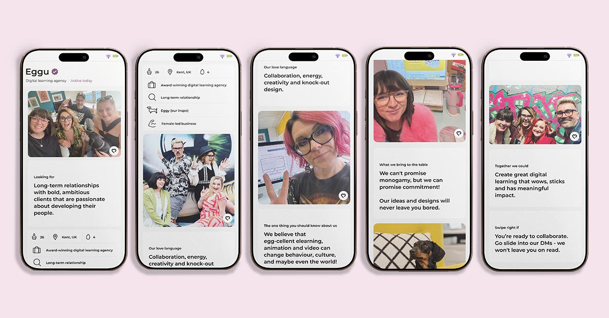
You know the feeling. A match made in learning-design heaven – and we think you’re the one!
Are we your type?
This is our digital serenade – and we’re hoping to strike the right chord.
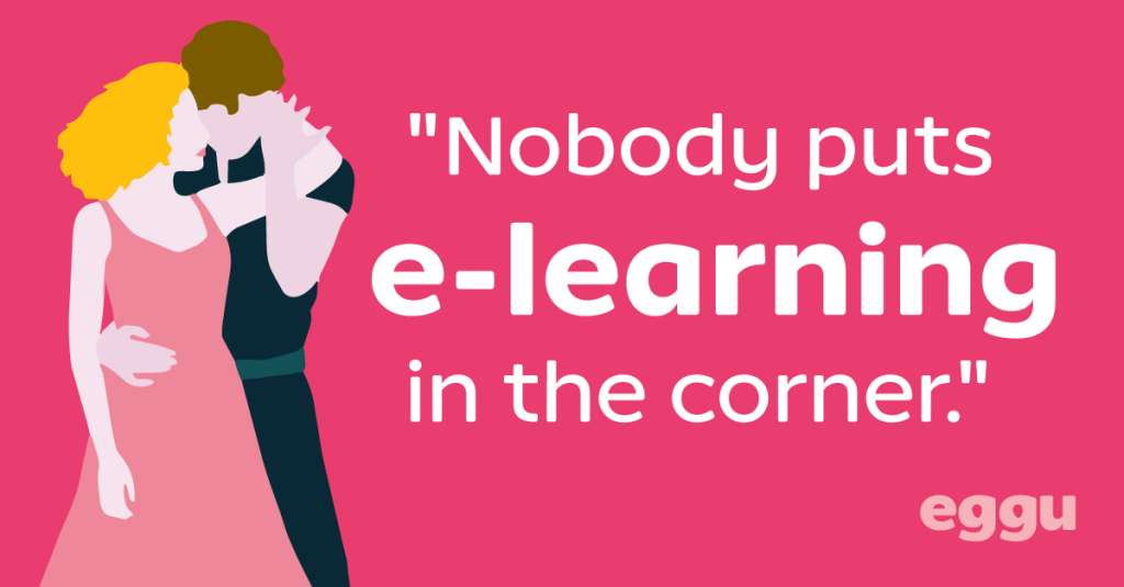
At Eggu, we’re passionate about creating egg-ceptional (had to do it), design-led and cost-effective digital learning solutions. E-learning might not sound sexy, but trust us – it absolutely can turn heads.
We care deeply about our clients, their learners, and the knock-out work we create together.
We can’t promise monogamy, but we can promise commitment! We’re in it for the long-haul.
Want to make it egg-sclusive?
Love is in the air and we’re putting our creativity where our heart is.
We’ve even put together our own dating profile to win you over.
There’s no escape – but honestly, I’m not mad about it. Somewhere along the way, I’ve become fully invested, living alongside my own small demon-hunter wannabe and absorbing the film’s energy by osmosis.
And as a digital learning designer, that’s when the familiar itch kicked in.
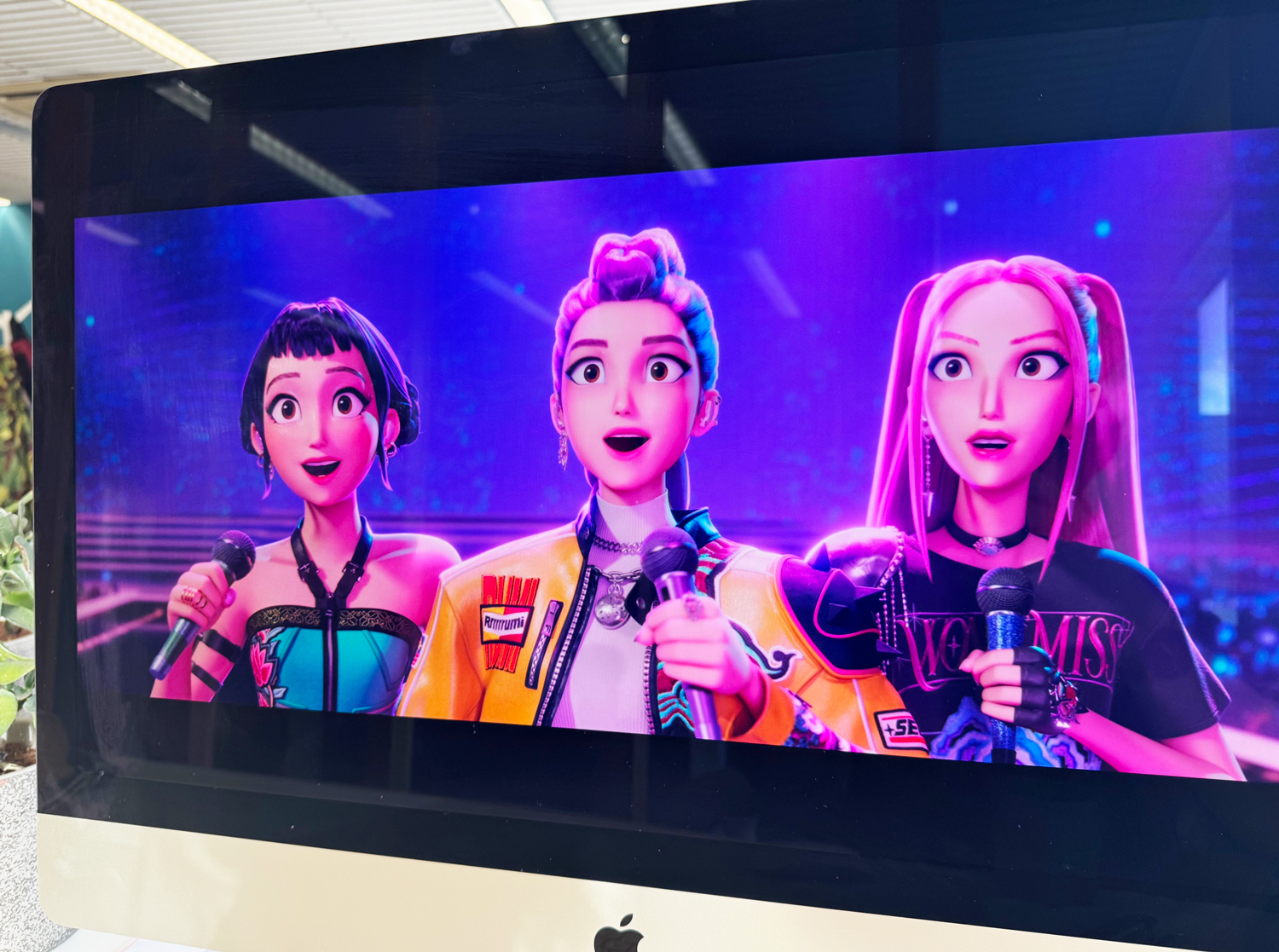
Because this kind of mass obsession doesn’t happen by accident. Netflix’s K-Pop Demon Hunters isn’t just successful because it looks good or sounds great (though it absolutely does). It works because it understands how people get hooked, stay engaged, and come back for more.
Which got me thinking… What if we stopped dismissing pop-culture franchises like this as “just entertainment” and instead looked more closely at the mechanics underneath?
So, in this post, I want to unpack what K-Pop Demon Hunters gets right about engagement, identity, and momentum, and explore how those same ideas can (and should) influence how we design digital learning experiences.
Because if a demon-hunting K-pop group can hold attention this effectively… there’s probably something in there worth shamelessly stealing.
1. Identity first, content second
K-Pop Demon Hunters doesn’t start by explaining how demon hunting works. It starts by showing us who these characters are.
Demon hunting is part of their identity, not a checklist of competencies.
What digital learning can learn from this
Too many learning experiences lead with content: modules, objectives, and information. But learners don’t commit to content. They commit to who they are becoming.
When learning is framed purely as knowledge transfer, motivation stays fragile. When learning is framed as identity development, engagement deepens. Learners persist because the learning feels personally meaningful, not just professionally required.
When learners see themselves in the role, effort stops feeling optional.
Design takeaway
Frame learning as identity development (“becoming a practitioner,” not “completing training”)
Use role-based language and scenarios
Reinforce identity throughout the journey, not just at the end
2. Emotional stakes drive engagement
In the film, failure matters. Letting the team down matters. Losing control matters. The emotional stakes make every training moment feel meaningful.
Now, contrast that with many digital courses, where the worst outcome is… clicking “retry”.
What digital learning can learn from this
Low-risk learning is safe, but zero-stakes learning is forgettable.
When nothing meaningful is at risk, learners disengage emotionally. They may complete the course, but they rarely carry the learning forward.
Emotion is not the enemy of learning. It’s the engine.
Design takeaway
Show real consequences of poor decisions (even simulated ones)
Use scenarios where outcomes affect people, teams, or patients – not just scores
Let learners feel tension, responsibility, and relief
3. Rhythm, pacing, and momentum
The franchise has a clear rhythm:
Training
Setback
Adjustment
Breakthrough
Performance
There’s intensity, then recovery. Action, then reflection. Nothing drags, and nothing is rushed.
This rhythm is what keeps the story moving. Viewers are never stuck in one mode for too long, and emotional energy is managed with care.
Pauses aren’t wasted time too – they’re what make the breakthroughs possible.
What digital learning can learn from this
Learning isn’t a straight line, and it shouldn’t feel like one.
Yet many digital learning experiences are designed as uninterrupted stretches of content: watch, read, click, repeat. Even strong material can start to feel heavy when it’s delivered at a single, unchanging pace.
Good pacing keeps learners moving. Bad pacing makes even great content feel exhausting.
K-Pop Demon Hunters understands that momentum comes from variation, not speed.
Design takeaway
Break long content into energetic, purposeful segments
Alternate challenge with reflection
Design for momentum, not endurance
4. Style is part of the message
The visuals, music, choreography, and fashion in K-Pop Demon Hunters aren’t decoration. They are the message.
Style signals:
This matters
This is intentional
This is worth your attention
What digital learning can learn from this
Design communicates values before a single word is read.
Learners form an impression within seconds:
Is this worth my time? Does this feel credible? Does anyone care?
If learning looks disposable, learners will treat it that way.
Too often, visual design in learning is seen as “polish” – something nice to have if there’s time or budget left over. But K-Pop Demon Hunters shows us that style isn’t superficial; it’s how meaning is delivered.
Design takeaway
Treat visual design as meaning, not polish
Maintain consistent tone, visuals, and interaction patterns
Make learning feel modern, thoughtful, and human
5. Transformation is the real reward
Perhaps this is the moment to question our increasing reliance on fully remote behaviours and whether By the end, the biggest payoff isn’t defeating demons, it’s seeing how the characters have changed:
More confident
More trusting
More capable
More grounded
The external victory matters, but it’s the internal shift that stays with you. That transformation is what sticks.
What digital learning can learn from this
Certificates don’t motivate. Growth does.
People stay engaged when they can feel themselves changing. When they notice their confidence rising, their judgement sharpening, or their thinking becoming more nuanced. That sense of personal evolution is far more powerful than any badge or score.
Design takeaway
Reflect on “before vs after”
Show how thinking, confidence, or judgement has evolved
Measure progress over time, not just completion
6. Community creates retention
K-Pop Demon Hunters doesn’t survive on story alone – it thrives on fandom. Community keeps people engaged between releases, long after the credits roll.
Fans don’t just watch the film and move on. They talk about it, rewatch scenes together, share favourite moments, debate character choices, and build a shared language around it. The franchise becomes something people belong to, not just something they consume.
That sense of belonging is what sustains attention over time.
What digital learning can learn from this
A course might end, but learning shouldn’t. Content alone is rarely enough to keep people coming back.
In digital learning, we often design for completion: finish the module, pass the assessment, get the certificate. But once that moment passes, the learner is usually on their own again. No shared space. No continued conversation. No sense that their learning journey connects to anyone else’s.
K-Pop Demon Hunters shows us the opposite approach: community is the glue that holds engagement together.
Design takeaway
Design for shared experience through learning groups or even light-touch peer visibility
Create spaces for reflection and discussion, not just answers
Extend the learning beyond the course with follow-up challenges or shared practice spaces
7. Rewatchability = Relearning
The film rewards repeat viewing. You notice new details. Emotional moments land differently. Understanding deepens.
That’s not accidental – it’s design.
The film is built to be revisited, not consumed once and forgotten.
In K-Pop Demon Hunters, the story doesn’t change – the viewer does. That’s why repeat viewing feels rewarding.
What digital learning can learn from this
Digital learning can work the same way when it’s designed to grow with the learner.
Understanding deepens with experience. What felt abstract at the start becomes meaningful once you’ve tried to apply it in the real world. When learners return to content later, they bring new questions, new challenges, and new perspective.
So, good learning should invite return visits. If learning only works once, it’s not finished.
Design takeaway
Design content that reveals more with experience
Support non-linear revisiting
Enable just-in-time refreshers, not one-and-done journeys
Final thought
K-Pop Demon Hunters works because it understands something digital learning often forgets:
People don’t engage with information – They engage with identity, emotion, rhythm, style, transformation, and belonging.
The demons may be fictional, but the learning principles are very real.
If you’re rethinking a digital learning project, we’d love to explore it with you.
The conversation around AI in Learning and Development is accelerating at a pace that feels both exciting and unsettling.
Every week brings a new tool, a new promise. Faster content creation, personalised learning pathways, automated admin, streamlined workflows. From an efficiency point of view, the benefits are hard to argue with.
And yet, I find myself conflicted.
Yes, AI has the potential to radically improve how we work in L&D. It can remove friction, free up time, and help us focus on higher-value tasks. But when we look beyond short-term gains, it’s worth asking a harder question.
What does the future of L&D actually look like if we don’t slow down and think critically?
Efficiency vs. purpose
There’s a growing risk that the creative processes behind digital learning development become undervalued or even redundant. Instructional design, storytelling, collaboration, iteration – these have traditionally been deeply human processes, shaped by empathy, experience, and understanding context.
If AI can generate courses, assessments, videos and feedback in seconds, what happens to the people whose skills lie in crafting meaningful learning experiences?
More uncomfortably, who exactly are we training for, if entire roles and industries begin to disappear?
The threat of mass job losses isn’t speculative anymore. It’s already happening, and L&D doesn’t sit outside that reality. If learning exists to support people at work, then the erosion of work itself has to be part of the conversation.
The one thing AI can’t replace
Setting aside the controversial (and slightly dystopian) rise of AI companions and simulated relationships, there is one thing AI still fundamentally cannot replicate: real human connection.
Connection isn’t just a “nice to have” in learning – it’s foundational.
People learn best when they feel seen, supported, challenged, and understood. They grow through conversation, collaboration, disagreement, shared problem-solving. No algorithm can replicate the nuance of human relationships, trust, or emotional intelligence in a meaningful way.
That human connection may well be our greatest remaining USP.
And yes, I see the irony
I should probably say this out loud. I work in digital learning. My job, in many ways, has been about removing the face-to-face teacher experience and translating it into something scalable, flexible, online.
I’ve helped replace classrooms with platforms, whiteboards with modules, live conversations with click-through content. So yes, I’m very aware of the irony.
But I think that’s exactly why this question matters so much.
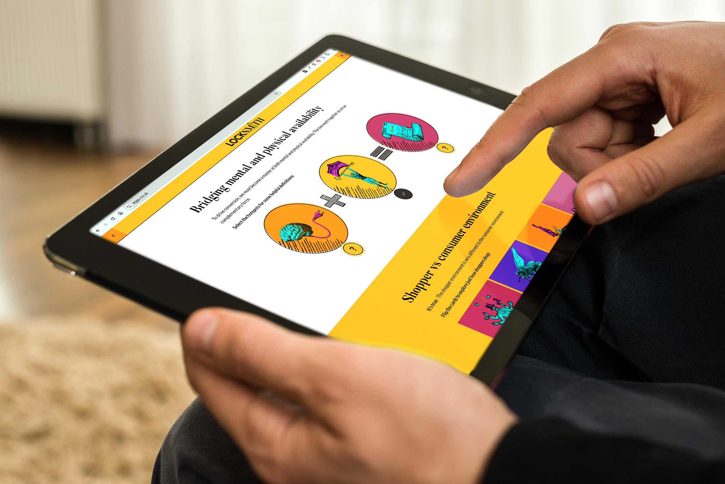
Digital learning was never meant to replace human connection. It was meant to extend and enhance it. To reach people who couldn’t be in the room. To support teachers, not erase them. To make learning more accessible, not more isolated. Digital learning should create space for better conversations, not eliminate the need for them. Our ongoing partnership with live marketing trainers LockSmith demonstrates just how this can work in harmony!
I still believe deeply in digital learning. I wouldn’t be doing this work if I didn’t.
But somewhere along the way, the balance has started to shift. What began as support is quietly becoming substitution. And AI accelerates that shift at a speed we’ve never had time to properly sit with.
A growing loneliness problem
This matters even more when we look at the wider social context. According to Office for National Statistics research published last month, 33% of Britons aged 16-29 reported feeling lonely often, always, or some of the time – the highest of any age group. By comparison, only 17% of over-70s reported the same.
That statistic should stop us in our tracks.
If younger generations are entering a world of work that is increasingly automated, remote, and mediated by AI, we need to ask what kind of impact that has on their sense of belonging, identity, and purpose. L&D has an opportunity, and arguably a responsibility, to counteract this trend rather than contribute to it.
Rethinking how we work together
Perhaps this is the moment to question our increasing reliance on fully remote behaviours and whether it’s time to rebalance how we work. Remote work has undeniable benefits, but it can also unintentionally strip away opportunities for spontaneous collaboration, creative energy, and genuine relationship-building.
There’s something powerful about people being in a room together:
Team collaboration
Brainstorming without agendas
Learning through observation
Building trust over time
These moments don’t always show up in productivity metrics, but they matter deeply, especially in L&D, where learning is inherently social.
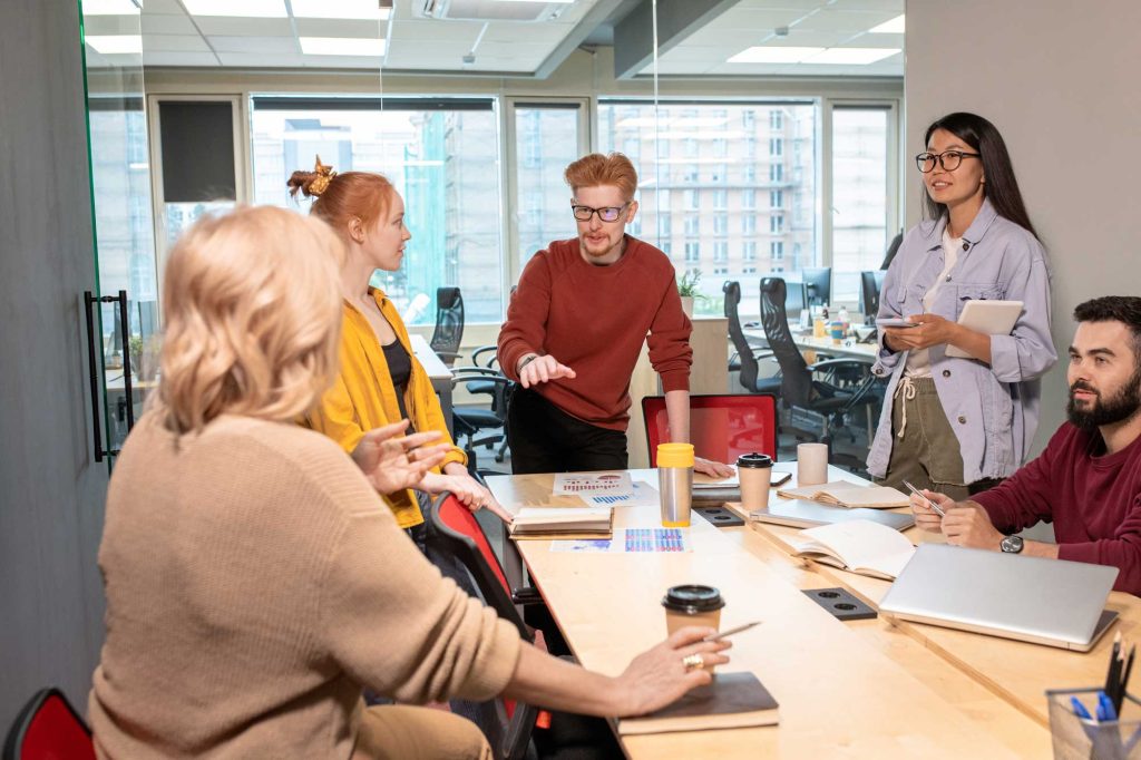
Recently, we advertised for a new member of our creative team. One of the biggest points of resistance we faced wasn’t the role itself – it was our request to work on site.
Remote working, for many people, no longer feels like a perk. It feels like a necessity.
And I get it. I really do. People are juggling childcare, caring responsibilities, long commutes, rising costs, and lives that are already stretched. Remote work often makes everything feel just that bit more manageable.
But here’s the thing – the proof really has been in the pudding.
Our new designer now works alongside us, side by side. And the difference has been tangible. We’re constantly creating together, testing ideas in real time, challenging each other, sharing quick feedback without booking meetings or sending messages into the void.
It’s fast. It’s collaborative. It’s human.
The working day is filled with conversation, laughter, problem-solving, and critical feedback — not just the polished kind, but the messy, half-formed thoughts that often lead to the best ideas. The result? Better output, stronger ideas, and a genuinely happy, supportive working environment.
It’s a world away from working solo, punctuated by the occasional Teams check-in.
And that experience has made me pause. Not because remote work is “bad” — but because we’ve perhaps been too quick to assume that digital-first always equals better. Especially in creative, collaborative spaces like L&D.
If we’re serious about protecting human connection in learning, we may need to be just as intentional about protecting it in how we work.
Using AI without losing control
None of this is an argument for rejecting AI outright. Used well, AI can be a powerful support, enhancing learning, removing admin burdens, and enabling better access to knowledge.
But support is the key word.
We need clear boundaries around where AI helps and where humans lead. Without those boundaries, we risk sleepwalking into a future where efficiency trumps empathy, speed replaces depth, and connection is treated as expendable.
This isn’t just about our own working lives. It’s about the world we’re shaping for our children and future learners. Once systems are embedded, they’re hard to undo.
A call for intentional L&D
The future of L&D shouldn’t be about how much we can automate – it should be about what we choose to protect.
Human creativity
Human connection
Shared learning experiences
Real, honest customer service
These are things AI can assist with, but never replace. If we lose sight of that, we risk building a learning ecosystem that is technically impressive but emotionally empty.
AI will be part of our future. The question is whether we remain fully part of it too.
This is the tension we live with at Eggu every day.
We build digital learning. We believe in it. And we also believe that learning works best when people feel connected to ideas, to each other, and to the work they’re doing.
AI can help us do better work. But it can’t replace curiosity, collaboration, or care. Those things still come from humans, working together, asking questions, and sometimes choosing the slower, messier path.
Digital learning isn’t going anywhere. The challenge and the opportunity is making sure it stays human.
If you’re heading into 2026 with questions about your digital learning – what to keep, what to change, and what to protect – let’s talk. Because better learning doesn’t always start with new tools.
Ever built a course and realised halfway through that you’re the one who doesn’t fully understand the topic? Yep, we’ve all been there.
The Feynman Technique is one of the quickest ways to expose fluff, jargon, and cognitive overload in your learning content. It’s not just a clever idea, it’s a practical tool that keeps both designers and learners honest.
Because, here’s the truth:
If learners can’t explain something back simply, they haven’t learned it.
If we can’t explain it simply, we haven’t designed it well.
Core concept
The Feynman Technique boils down to four deceptively simple steps:
Learn the concept
Explain it in plain, everyday language
Spot gaps and refine
Teach it again – even simpler
For digital learning, this is gold. It forces clarity, reduces cognitive load, and keeps the focus on understanding rather than information-dumping. Two things that instantly boost learner engagement.
How it transforms instructional design
1. Simplifies SME-heavy content
Most digital learning suffers because we dump everything the SME says straight onto a slide. The Feynman approach pushes us to translate expert language into learner language. The heart of good instructional design.
2. Reduces cognitive overload
E-learning fails when we assume:
More info = Better learning
Feynman teaches us that:
Cleaner explanations = Deeper retention
3. Elevates storytelling
When you aim for simplicity, you naturally reach for:
Analogies
Metaphors
Real-life examples
Stories
These are the hooks that make learning stick.
4. Exposes your own knowledge gaps
Before building a module, ask yourself: “Could I explain this topic to a 12-year-old?”.
If not, you’re not ready to storyboard it.
The Feynman Technique Checklist
So here’s where the magic happens – turning the theory into a repeatable habit you and your team actually use.
Try our simple checklist to embed into your design process:
1. Discovery
“Let me quickly play this back in simple terms so I’m sure I’ve got it right…”
I can explain the topic in simple language
I’ve confirmed that explanation with the SME
2. Design
Write a one-paragraph Feynman summary as your clarity anchor.
Focus on the core idea
Make all learning objectives flow from that summary
3. Script
Strip out anything that doesn’t help understanding.
Jargon removed or translated
Concepts broken into digestible chunks
Analogies added where helpful
4. Review
Before sign-off, run a teach-back test.
Someone uninvolved can explain the concept simply
Assessment includes at least one teach-back style question
Your challenge
Next time you design a module, try explaining the core concept in 60 seconds. If you can’t? Tighten it. Simplify it. Feynman it. Turning simplicity into great learning.
The Feynman Technique is powerful, but implementing it consistently across complex, SME-heavy projects isn’t always easy. That’s exactly where Eggu’s instructional design team thrives.
We specialise in:
Breaking down complicated topics into clean, learner-friendly pathways
Removing cognitive clutter
Turning dense knowledge into memorable stories, examples, and interactive
Designing digital learning that’s simple and smart (not simplistic)
If you want 2026 to be the year your learning content becomes clearer, sharper, and far more impactful, let’s talk.
Get in touch to discuss your New Year learning goals.
Every January, something interesting happens in the world of workplace learning.
Logins climb, course completions jump, and suddenly everyone seems just a little more open to upskilling. It’s not magic – it’s mindset.
The new year gives people a natural “reset button,” and that fresh-start energy spills straight into how they approach their development. While budgets might be tight and teams stretched, January is hands-down one of the most powerful windows to re-engage staff with training and set the tone for the year ahead.
If you’ve ever wondered why LMS engagement peaks right after the holidays, or how to make the most of it?
Here’s the science, the strategy, and the simple wins that can turn January into your strongest learning month of the year.
1. The fresh start effect
Psychologists have been banging on about this for years:
People are way more likely to set goals, start learning, and commit to self-improvement immediately after a temporal landmark – New Year, birthdays, quarter-ends, etc.
Learning platforms consistently report their highest logins, course starts, and completions in January–February.
This is the moment when your team wants to do better. All you have to do is point them to the learning.
2. Quiet(er) inboxes, fewer competing priorities
The first couple of weeks of January tend to be:
Fewer meetings
Project cycles restarting
Lower operational pressure
Perfect conditions for focusing on training.
LMS logins typically increase 10–30% in January compared to December.
3. Managers are in planning mode
Leadership is doing:
Annual objectives
PDPs
Appraisal follow-ups
Skill-gap mapping
Learning fits naturally into this rhythm. When managers are planning, training recommendations feel timely rather than tacked on.
4. Employees are actively looking for development direction
For years, translating e-learning was slow and complicated. You had to rebuild or manually edit each In January, people are asking themselves:
Where am I heading?
Do I want a promotion?
A new skill?
A better role?
What should I be improving this year?
That mindset is rocket fuel for LMS engagement.
Curiosity + ambition + clarity = logins and completions
In fact, completions often rise 15-25% in Q1 across corporate training.
5. Training helps set the tone for the entire year
Rolling out learning early:
Signals that development matters
Reinforces culture
Boosts motivation post-break
Creates early wins
Organisations that set training goals in January maintain higher year-round engagement.
Don’t let the best month for learning pass you by
Build with intention, invest in your people, and give your organisation the kind of start that lasts.
When you start the year with clarity, confidence, and well-designed learning experiences, you set the tone for everything that follows.
And that’s exactly where a digital learning design partner like Eggu can help.
Whether you’re refreshing outdated modules, launching new capability programmes, or setting ambitious training goals for 2026, you don’t have to do it alone. Together we can turn January’s fresh-start energy into genuine performance gains all year round.
If you’re ready to make 2026 your strongest learning year yet, Eggu would love to help you get there.
Get in touch to discuss your New Year learning goals.
Digital learning has opened doors across the world. Today, organisations can reach learners in every region, time zone, and language – all with the same course.
But here’s the catch. If that course only speaks one language, or doesn’t reflect the learner’s culture, the experience can quickly lose impact.
Learning hits harder in your own language
True learning happens when the content feels like it was made for you – in your language, using examples you understand, and visuals that feel familiar.
Research shows people learn better in their native language. When learners can read, listen, and interact in words that feel natural, they stay engaged longer and remember more.
And it’s not just about understanding the content. When training feels local but still clearly reflects the organisation’s brand, it also sends a powerful message: you belong here. It builds trust and a sense of inclusion.
More than words – it’s about culture
Mighty gives Rise a creative boost – more flexibility, more polish, same simplicity. Localisation isn’t just translation. It’s about making learning fit the learner’s world.
That means thinking about things like:
Local sayings, examples, and references
Colours, imagery, and people that feel familiar
Regional rules or compliance differences
Accessibility and reading direction (like right-to-left languages)
When learning looks, sounds, and feels local, it’s far more likely to land with impact.
Why localisation is now essential
In some industries, delivering training in a local language isn’t just nice to have – it’s a legal requirement. But even beyond compliance, localisation shows care. It’s about inclusion and accessibility – making sure every learner, everywhere, gets the same quality of experience.
An English-only course might once have been acceptable, but in a global workforce, it now feels outdated. Localisation tells people: we see you, and this is for you.
The technology has finally caught up
For years, translating e-learning was slow and complicated. You had to rebuild or manually edit each version. A nightmare for global teams!
Now, AI-powered tools are changing that. Our current favourite on the market is Articulate Localization (part of the Articulate 360 suite) and modern workflows like XLIFF export/import, you can:
Translate courses instantly into 80+ languages
Keep a glossary so brand terms stay consistent
Let reviewers check and approve translations right in the platform
Manage all language versions as one single project
Publish all languages together in a single package
It’s faster, smarter, and crucially affordable. If you already use Articulate 360, you can even update your translated courses at no extra cost within the same subscription.
Built for modern learning teams
Articulate Rise 360 has always been known for its simplicity and speed. Now, with built-in localisation, it’s even better suited to global learning projects.
Courses automatically adjust layouts for different text lengths and support right-to-left languages like Arabic and Hebrew. That means less time fixing formatting and more time focusing on great learning design.
Sure, AI translation isn’t perfect. Complex or technical topics still need that human eye – but for most learning content, it’s an excellent starting point.
How other tools compare
From our research, Gomo stands out as another strong player in this space, supporting over 160 languages. It’s great for very large-scale global rollouts.
That said, its design options are a bit more limited compared to Articulate Rise, especially now that Rise can be enhanced with custom design tools like the Maestro “Mighty” plugin, which gives teams more freedom to match their course design to their brand style.
So, if you need wide language coverage, Gomo is powerful. If you want a balance of translation efficiency and beautiful, brand-aligned design, Rise is hard to beat.
The impact of getting it right
When localisation is done well, everyone benefits:
Learners engage more and complete more courses
You save time and money by avoiding rework and support calls
Global teams roll out training faster and more consistently
Compliance standards are easier to meet
Your brand feels strong and connected across every region
The bottom line
In today’s connected world, localisation isn’t a luxury – it’s a necessity. It transforms digital learning from a one-size-fits-all broadcast into a personal, meaningful experience.
At its heart, localisation is about people. It’s about making every learner feel seen, valued, and included, no matter where they are in the world.
When training speaks a learner’s language and reflects their culture, it shows respect and builds connection. That’s when digital learning stops being just information delivery and starts becoming real communication.
The future of learning is global, and global learning only works when it feels local.
As experts in Articulate 360 (Rise and Storyline) elearning design and development, Eggu are the perfect partner to support you in creating affordable, branded learning experiences, delivered in multiple languages.
Get in touch with Eggu about your next localised Rise project.
If you’re already building your elearning in Articulate Rise 360, you probably love how quick and simple it is to use.
But maybe you’ve also wished you could do just a bit more – a little extra polish, a little more personality, a little closer to your brand. That’s exactly where Mighty comes in.
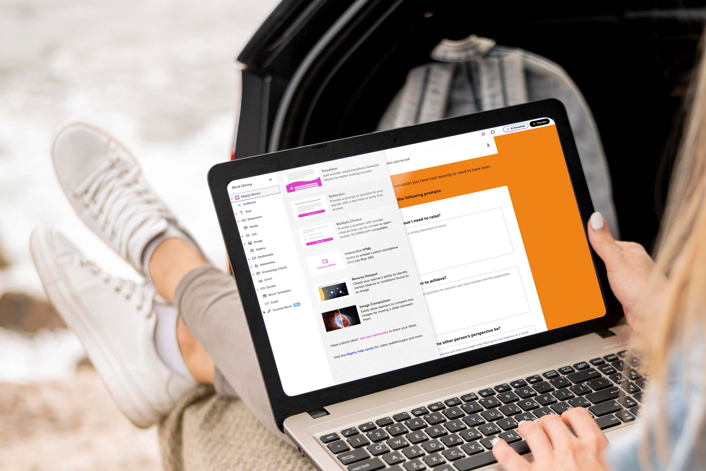
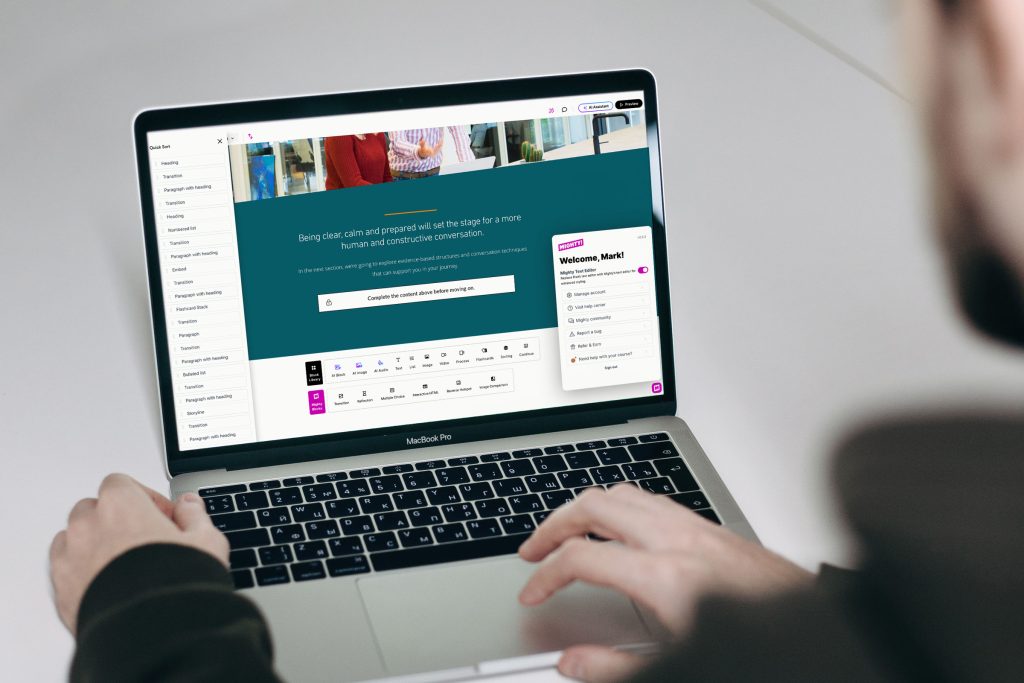
So, what is Mighty?
Mighty is a Chrome browser extension created by Maestro Learning that plugs straight into your normal Rise 360 workflow. It’s not made by Articulate (the company behind Rise), but it works right alongside it, adding extra design options, new content blocks, and more creative control.
Think of it as a set of design “power-ups” that unlock features Rise doesn’t include out of the box. You still build your course in Rise, but now you can adjust things like typography, colours, transitions, and layout with far more flexibility.
And the best part? You don’t (always) need to know any code.
What does Mighty add?
Mighty gives Rise a creative boost – more flexibility, more polish, same simplicity.
Here’s what it brings to the table:
Extended typography controls: Fine-tune font size, spacing, and line height so your text looks perfectly balanced.
Custom colour palettes: Save and reuse your brand colours across every element of your course.
New visual and interactive blocks: Add reflection prompts, custom buttons, multiple choice variations, transitions, and other engaging layouts.
Enhanced transitions and animations: Create smoother, more dynamic movement between sections.
Quick styling tools: Adjust spacing, alignment, and backgrounds directly in Rise.
Quick sort: Faster, more effective means of relocating sections within your course.
No extra software is needed. It all runs inside your normal browser.
In short, Mighty turns Rise from a rapid authoring tool into a brandable design environment, giving you the creative freedom to make your learning look uniquely yours.
Why does it matter for brand?
Your brand doesn’t stop at your website or brochures, it should shine through in every learner experience. When people open your training, they should instantly recognise your look and feel.
Mighty helps you achieve that consistency. With its extra control over fonts, colours, and layouts, you can design learning that feels professional, polished, and unmistakably connected to your organisation.
For learners, that familiarity builds trust. For your brand, it adds credibility. And for your team, it proves that quick-build learning doesn’t have to look “off the shelf.”
How it works in practice
Install the extension in Chrome (or Edge).
Open Rise 360 – You’ll see new “Mighty” blocks and tools right alongside the standard Rise ones.
Build your course as normal, using the extra controls to tweak typography, colours, and transitions.
Publish your course – Learners don’t need the extension; all the custom styling is baked into the final output.
You still get all the speed of Rise’s rapid development, but with a much higher design standard.
Why do designers love it?
Mighty gives you the kind of creative flexibility that used to require a developer. You can:
Match your exact corporate fonts and colours.
Add elegant transitions between sections.
Use reflective or interactive blocks to increase engagement.
Bring a sense of motion and flow that standard Rise sometimes lacks.
It’s simple enough to use, yet powerful enough to make a noticeable visual difference.
Things to keep in mind
Like most good tools, Mighty isn’t free. It’s a paid extension (around $47/month or $337/year per user, with discounts for annual plans).
If your subscription ends, your published courses will still run fine, but you won’t be able to edit Mighty-specific elements until you renew.
And while it simplifies design tweaks, it still relies on good design judgement. Colour balance, accessibility, and clarity still matter just as much as new features.
Always evolving
One thing users appreciate about Mighty is how actively it’s being developed. New features roll out regularly, often every few weeks or months rather than once a year.
The current version (6.6.3) was released in November 2025, and Maestro even runs an Early Access programme so users can test and give feedback on upcoming tools before they’re public.
While the team hasn’t published a full public roadmap, here’s what’s likely on the horizon:
Advanced scripting and “Power-ups” for more custom behaviours.
New block types for branching, scenarios, and more animation options.
Improved collaboration tools for teams sharing templates or reviewing builds.
Better localisation and accessibility options (such as right-to-left layouts).
Enhanced analytics and tracking for deeper learner insights.
The takeaway
Mighty gives learning teams a practical way to make Rise courses look modern, branded, and engaging, all without slowing down the build process.
For anyone who loves Rise but has ever thought, “I wish I could just tweak this one thing,” Mighty is that missing piece.
It’s a simple, powerful way to elevate your design, turning quick courses into custom, on-brand experiences that truly stand out.
As experts in Articulate 360 (Rise and Storyline) elearning design and development, Eggu are the perfect partner to roll out your custom-created branded learning experiences, or support to enhance the work of your in-house digital learning teams.
Get in touch with Eggu about your next Rise project.
![Valentine’s Day: We love [working with] you!](https://www.eggu.co.uk/wp-content/uploads/2026/02/heartshape-email-header_1.gif)