As Halloween creeps closer, it’s the perfect time to face the monsters lurking in your digital learning library.
Great learning should raise spirits, not the dead.
If your digital learning feels more frightful than delightful, here are three classic horror villains you might recognise…
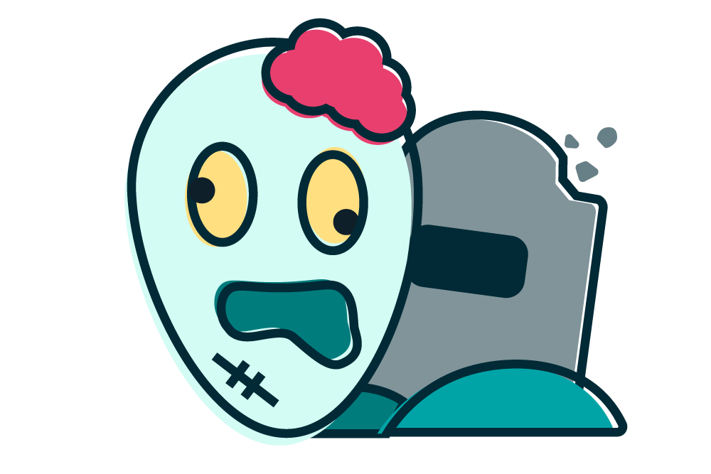
1. The Zombie
Lifeless, repetitive content that won’t die
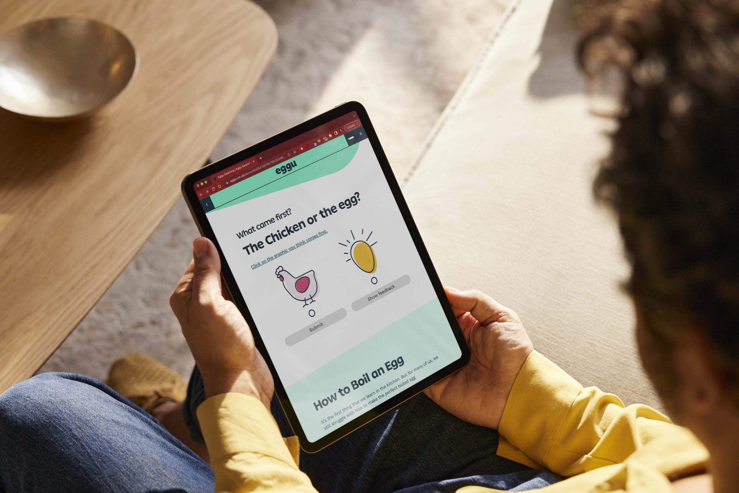
This course staggers on year after year — recycled slides, endless clicking, no spark. Learners go through the motions, but nothing sticks.
The symptoms
- Resurrected PowerPoint style content
- Walls of text that drain the life from learners
- Learning objectives that haven’t changed since last Halloween
How to fight it
Resuscitate your content by injecting the cure – focus on real-world scenarios, add storytelling, quick interactive challenges, catchy visuals, or actual voices from your audience. Fresh context makes familiar topics come alive again.
2. The Vampire
Drains all enthusiasm from learners
This course might look slick – shiny graphics, smooth voiceover – but behind the polish, it’s sucking the energy out of everyone who goes near it.

The symptoms
- Learners click “next” faster than you can say “bloodsucker”
- No emotional spark – just endless instruction
- It talks at learners, never with them
How to fight it
Add warmth and humanity by designing with empathy. Use a conversational tone and relatable scenarios. Cut the jargon and make space for reflection or humour – even compliance training deserves a heartbeat!
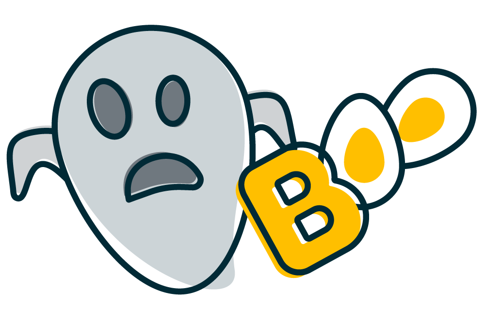
3. The Ghost
Vanishes after launch
You launched the course. Everyone completed it…then nothing. No buzz, no feedback – just a deathly silence.
The symptoms
- No follow-up or discussion after completion
- No visible behaviour change
- Lost in LMS reports and annual review, never to be seen again
How to fight it
Learning shouldn’t end at the final quiz. Plan for post-launch existence – follow-up nudges, reflection prompts and managers’ conversations will keep it alive.

Escaping these horrors doesn’t take magic – just mindful design
Make sure to start with purpose, ask yourself “What problem are we solving?”. Designing for actual challenges and not just sticking to a generic course outline will keep the learning ‘people focussed’. To keep it interesting and appealing; review regularly, refresh and rebuild the content and design to give the course energy and relevance. Breathe life into it before it gets frighteningly dull!
Truly good learning doesn’t scare learners away, it draws them in, keeps them curious, and leaves a lingering impression.
Check out our top ‘tricks’ to keep your digital learning fright-free this halloween:
- Keep it alive: Refresh stale content and design before it becomes a mindless shuffle
- Resurrect engagement: Design for humans, not content checkboxes – connect with your learners
- Cast your spells wisely: Use empathy and storytelling to enchant your learners
- Don’t be invisible: Follow up after launch so learning doesn’t vanish without a trace
- Stay vigilant to scares: Revive dated courses to energise learners