Elevating digital learning design: The new Rise 360 updates

In digital learning, one of the biggest challenges has always been finding the sweet spot between speed, creativity, and brand identity.
We all want courses that look great, feel consistent with our organisation’s style, and are quick to build and update. But in the past, those goals didn’t always go hand in hand.
Tools like Articulate Rise 360 made course creation fast and accessible, but often at the cost of design individuality.
You could build great learning quickly, but it sometimes looked like, well… everyone else’s.
Thankfully, that’s now changing – and fast.
Over the past year, Rise has introduced a wave of new design features that give learning teams far more creative freedom. You can now build digital learning that doesn’t just work beautifully on any device, but also looks and feels like your brand.
More freedom to make it your own
One of the biggest and most exciting changes is custom themes. Rise now offers stylish layouts like Apex and Horizon, which you can tweak to match your organisation’s colours, fonts, and navigation style.
It means your courses can finally look like your brand — not just generic templates. With just a few clicks, you can align buttons, headers, and menus with your visual identity, so learners instantly recognise who the course is from.
And best of all? You don’t need to touch a single line of code.
A smoother, more polished look
Small design details make a big difference. Rise’s improved font and text controls make it easier to apply your chosen typefaces consistently across the whole course – keeping everything neat, readable, and on-brand.
It’s a subtle upgrade that helps courses look more professional and cohesive – the kind of polish that learners might not consciously notice, but absolutely feel.
More ways to bring content to life
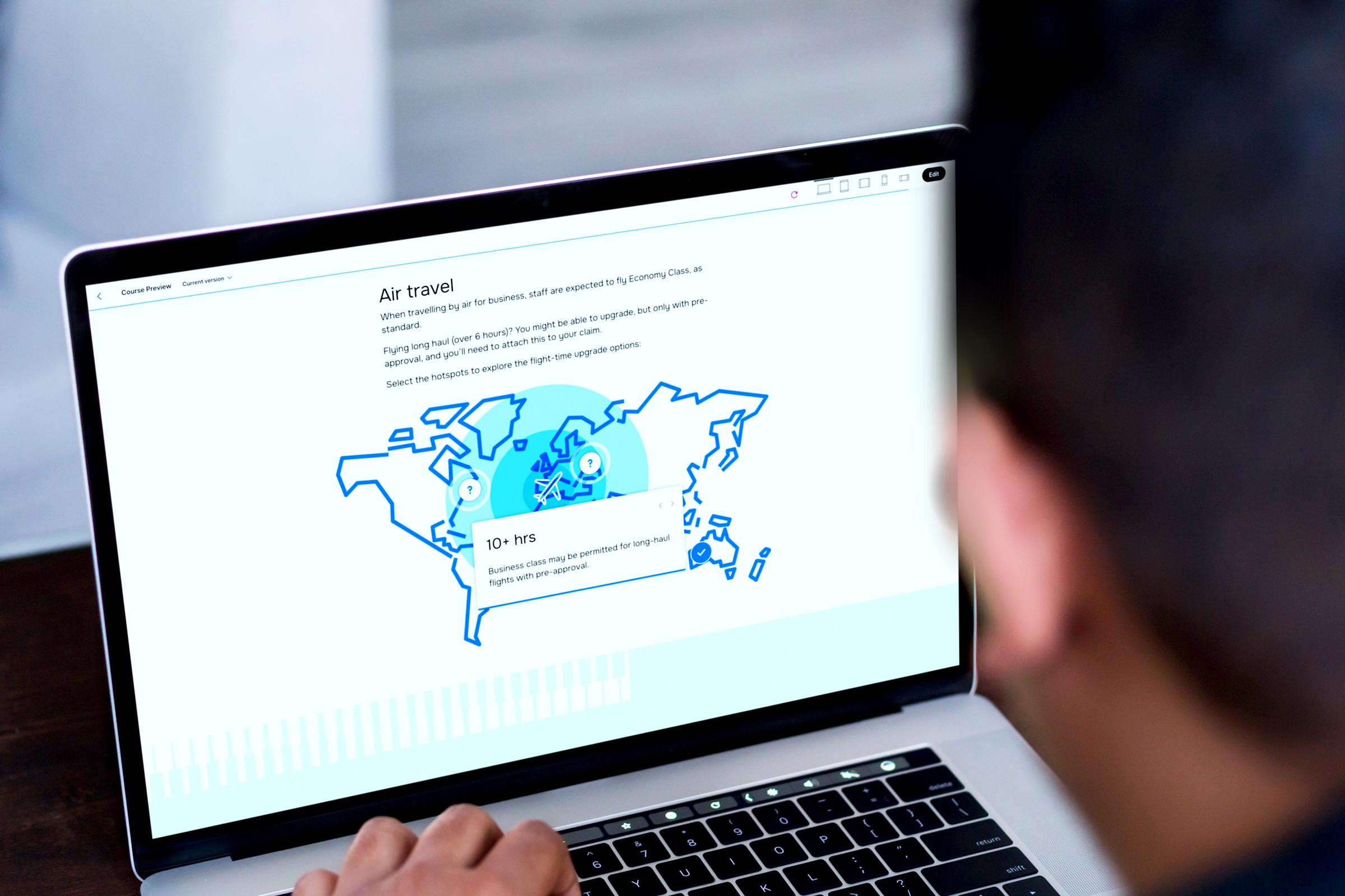
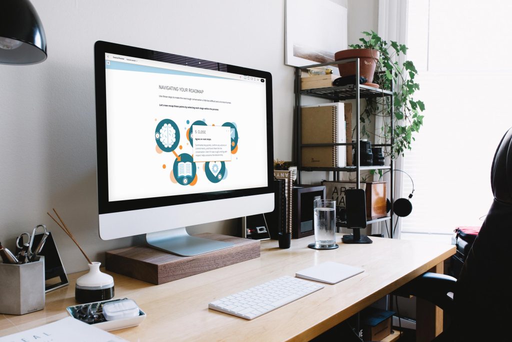
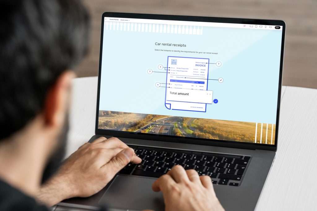
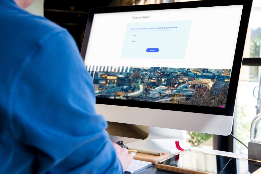
Rise also gives you more creative control over how content appears on screen. You can now use:
- Background images and colours to break up sections
- Different header styles to create emphasis
- Gentle animations to add flow and visual interest
All of this adds personality to your learning without slowing down production. You can create courses that are clean, modern, and visually engaging — without needing a graphic designer or developer to get involved.
Designed for global teams
If you’re rolling out learning to people across different regions, you’ll love Rise’s improved translation and localisation features.
You can export your text for translation and easily import it back in – no rebuilding required. Rise even supports right-to-left languages like Arabic and Hebrew and automatically adjusts layouts to suit different text lengths.
That means your course design stays consistent, no matter what language it’s in.
Easier editing for busy teams
Behind the scenes, Rise has also improved its text editing tools, making formatting faster and more reliable. It’s the kind of behind-the-curtain upgrade that makes everyday authoring smoother, especially when you’re juggling multiple modules or working with several contributors.
Why do these updates matter?
Learners might not always think about why a course looks professional or polished, but they definitely notice when it doesn’t.
A well-designed, brand-aligned learning experience builds trust and keeps people engaged. It tells your audience, this matters – and so do you.
These updates mean that learning teams can now:
- Build faster without sacrificing creativity
- Keep every course visually consistent with the wider brand
- Deliver a more polished, engaging learner experience
- Spend less time fixing formatting and more time creating great content
A new era for learning design
What’s exciting about all of this is that the gap between “template-based” and “custom-built” learning is closing.
With the new Rise 360, teams no longer have to choose between beautiful design and quick turnaround. You can have both – scalable learning that looks as good as it performs.
In short, Rise now makes it possible to build learning that’s fast, flexible, and unmistakably yours.
And with new tools like Mighty – a Chrome browser extension created by Maestro Learning that plugs straight into your normal Rise 360 workflow – you can add even more design options, new content blocks, and take more creative control.

Looking ahead
As digital learning continues to evolve, design quality is becoming just as important as content quality. Learners expect engaging, visually appealing experiences. And now, tools like Rise make that easier than ever to deliver, in multiple languages too.
It’s a big win for L&D teams, designers, and learners alike. Courses that are faster to build, easier to manage, and a whole lot more enjoyable to experience.
As experts in Articulate 360 (Rise and Storyline) elearning design and development, Eggu are the perfect partner to roll out your custom-created branded learning experiences, or support to enhance the work of your in-house digital learning teams.
Get in touch with Eggu about your next Rise project.
More eggtremely useful stuff...